A written household plan closes the gap between owning supplies and being able to use them under pressure. A flashlight, stored water, or first-aid kit has limited operational value if nobody knows where it is, one person holds the only key, or family members disagree about whether to leave. The plan assigns meaning to those resources by connecting them to decisions, locations, responsibilities, and backup options.
Emergencies disrupt ordinary coordination. Mobile networks may become congested, household members may be at work or school, familiar roads may be blocked, and power loss can make digital contact lists unavailable. Deciding everything after disruption begins consumes time and creates conflicting actions. One adult may drive home while another heads to a school, for example, leaving both delayed and uncertain about the other person’s location.
A practical plan establishes common expectations before that confusion develops. It identifies where household members will meet if the home is inaccessible, which person will collect medications, and how everyone will report their status. An out-of-area contact may serve as a communication relay when local calls are difficult: each person sends that contact a brief location and safety update rather than repeatedly trying every family member.
The value is not limited to major disasters. A localized apartment fire, extended outage, fast-moving weather event, or gas leak can create the same immediate questions. Should the household shelter or evacuate? Who checks on an older relative? Can a pet carrier be reached quickly? Which exit remains usable if the normal door is blocked? Planning converts those questions into conditional choices rather than rigid predictions.
A common misconception is that a supply kit is the plan. Supplies support a response, but they do not settle competing priorities or reunite separated people. Conversely, a detailed binder without accessible equipment is equally weak. The better approach joins a short action plan with reachable supplies, relevant information, and practice. Signs of a useful plan include household members being able to explain it without prompting and complete a basic drill without depending on the person who wrote it.
Which Problems Should the Plan Solve?
The plan should solve the household’s most plausible coordination failures, not attempt to script every possible disaster. Begin with local conditions and the home’s characteristics. Wildfire exposure may make early departure and several driving routes central concerns, while severe winter weather may place greater weight on heat loss, safe indoor shelter, and the ability to remain home. Flood risk, high-rise living, limited transportation, and industrial hazards each change what deserves priority.
Every plan needs clear choices for both evacuation and sheltering. Evacuation instructions should name more than one exit, a nearby meeting point, a location outside the immediate neighborhood, and at least two routes where geography permits. Sheltering instructions should identify the safest suitable area for likely hazards and explain how household members will receive official information. Emergency alerts and directions from local authorities should take precedence over assumptions written months earlier.
Communication deserves equal attention because separation is common during normal weekdays. Record mobile numbers, school and workplace contacts, medical contacts where relevant, and one person outside the local area. Keep copies somewhere accessible rather than relying exclusively on a single phone. Messages should be brief and useful: name, current location, condition, and intended next move. Repeated nonessential calls can drain batteries and add confusion.
Household needs determine whether the plan works in practice. A generic template may miss insulin refrigeration, powered medical equipment, mobility limitations, sensory needs, infant feeding, language access, or an animal that cannot be transported without a carrier. Do not assume emergency responders can immediately replace individualized support. People who rely on medical devices or critical medication should discuss suitable backup arrangements with their healthcare providers and equipment suppliers.
A compact priority check keeps the plan focused:
Life safety: alarms, exits, shelter locations, and emergency warnings.
Reconnection: contacts, meeting places, school procedures, and backup communication.
Continuity: water, food, medication, lighting, charging, sanitation, and essential documents.
The recurring mistake is copying a broad checklist without resolving household-specific barriers. A plan that says “take the emergency bag” fails if the bag is too heavy for the available person or stored behind a jammed garage door. Walk through each action with the person expected to perform it. If that person cannot do it independently, reduce the load, move the equipment, share the responsibility, or identify an alternative.
How Do You Build a Plan People Can Actually Use?
A usable plan is short enough to consult quickly and specific enough to guide action. Start with a household discussion about likely warnings, safe exits, communication limits, and individual needs. Children should receive age-appropriate instructions, while adults should settle responsibilities rather than silently assuming someone else will handle them. Record the result on paper and store copies in predictable places.
Organize the plan by decisions rather than by abstract hazard descriptions. A simple action sequence might cover warning, immediate protection, communication, evacuation or sheltering, and reunion. Under evacuation, identify who takes the primary supply bag, who assists a household member, and who handles pets if time and conditions permit. Include a backup person for critical tasks because the primary person may be absent or injured.
Plan Element
Primary Choice
Backup
Failure Check
Communication
Text household group
Contact out-of-area person
Can numbers be found without a phone?
Nearby reunion
Named outdoor landmark
Second location away from the block
Is it reachable from each usual exit?
Evacuation
Main route and destination
Alternate route and destination
Does anyone lack transportation?
Essential items
Accessible supply kit
Smaller portable set
Can the assigned person carry it?
Documents require careful handling. Copies of identification, insurance details, medication lists, and key account contacts may aid recovery, but storing sensitive information creates privacy and security risks. Use a protected physical or encrypted digital method appropriate to the household, and avoid putting unnecessary credentials in an easily lost bag. Household members should know how to access what they genuinely need.
Connect the written plan to the physical home. Test smoke and carbon monoxide alarms according to manufacturer instructions, keep exits usable, place suitable supplies where they can be reached, and ensure everyone knows how utilities are handled. Household members should not attempt utility shutoffs unless they understand when and how to do so safely; local utilities or qualified professionals can provide location-specific guidance.
Complexity is a warning sign. Color-coded binders, multiple apps, and extensive inventories may appeal to an enthusiastic planner but burden everyone else. A one-page action sheet, contact card, and clearly stored supporting records are often more usable than a document nobody reviews. The plan is working when each person can state the first action, communication fallback, and meeting location. If only the author can interpret it, simplify the language and redistribute responsibility.
How Should the Plan Be Tested and Maintained?
Testing reveals whether the household’s assumptions survive contact with ordinary constraints. A discussion alone will not show that an exterior gate sticks, a child cannot open a window, a backup route is seasonally closed, or the pet hides when an alarm sounds. Short, calm drills expose those problems without trying to imitate panic or danger.
Begin with a notification and walk-through exercise. Ask household members what they would do if they were home, at work, at school, or unable to reach the usual meeting point. Then physically follow an exit route, locate the contact list, retrieve necessary items, and send a practice status message. Do not stage unsafe conditions, disable protective equipment, or enter hazardous areas for realism.
Measure useful outcomes rather than speed alone. Check whether everyone understood the signal, selected a safe route, reached the correct place, and completed assigned tasks. A fast drill that leaves a mobility aid behind or sends family members to different locations is a failure. A slower first attempt that uncovers an inaccessible supply container provides valuable information and a clear correction.
Maintenance should follow changes in the household as well as a regular review schedule. Recheck the plan when someone moves, changes schools or jobs, begins a new medication, acquires a pet, or loses access to transportation. Review contact details, routes, batteries, stored food, water containers, and medication arrangements. Replace expired or damaged items according to their labels and professional guidance rather than assuming every emergency product shares one schedule.
Real constraints require tradeoffs. Renters may have limited authority to modify a building, people without vehicles need transit or neighbor arrangements, and tight budgets may make gradual supply purchases more realistic than a large one-time kit. Prioritize alarms, communication, critical health needs, water, lighting, and realistic movement options before specialized equipment. Community resources can supplement a household plan, but they should not be treated as guaranteed or instantly available.
Failure signs include repeatedly missed drills, contacts nobody recognizes, plans stored only online, inaccessible equipment, and responsibilities assigned to absent or unwilling people. Correct one operational problem at a time, then retest it. The goal is not a flawless performance against every hazard; it is a household that can recognize changing conditions, use official instructions, communicate clearly, and shift to a workable backup when the preferred option fails.
Conclusion
The strongest household plan is not the longest document; it is the one family members can use when normal communication, transportation, or access to the home breaks down. Prioritize immediate safety, two ways to reconnect, workable shelter and evacuation choices, critical health needs, and clear responsibility for dependents. Match supplies to those decisions instead of collecting equipment without an operating purpose.
Choose one realistic disruption and walk through it with everyone in the household. Verify exits, retrieve the supply kit, test the contact fallback, and check whether each assigned person can complete the task. Record the problems that appear, correct the most consequential one, and run the exercise again. That cycle turns a static document into a dependable household capability while leaving room to adapt to official instructions and changing conditions.
Frequently Asked Questions
Is an emergency supply kit the same as a household plan?
No. A kit provides equipment and consumables, while a plan defines decisions, communication, destinations, and responsibilities. They work best when the plan identifies who can reach and carry the supplies.
How often should a household review its emergency plan?
Review it on a recurring schedule and whenever contacts, addresses, health needs, transportation, schools, jobs, or household membership change. Test critical actions rather than only rereading the document.
Should children be included in emergency planning?
Yes, with instructions suited to their age and abilities. Children should recognize alarms, know safe meeting locations, and understand which trusted adult or contact to use without being assigned unsafe responsibilities.
What if household members cannot evacuate by car?
Identify realistic alternatives before an incident, such as an agreed ride, accessible transportation, or locally available evacuation assistance. Confirm eligibility and procedures rather than assuming a service will arrive automatically.
Should the household use a paper plan or a phone app?
Use both when practical. Digital copies are easy to update, while paper contact cards and action sheets remain available when devices are lost, uncharged, damaged, or disconnected.
Further Reading
Authoritative Sources
American Red Cross Emergency Preparedness redcross.org
Provides household-focused guidance on emergency planning, preparedness supplies, communication, and common hazards
A rapid scene check determines whether approaching, remaining in place, or leaving is the safest choice. Before touching an injured person, opening a door, entering a damaged room, or driving toward an incident, pause long enough to identify threats that could injure you or worsen the event. Smoke, moving vehicles, downed wires, leaking fuel, aggressive behavior, floodwater, falling debris, and an unstable building all change what a safe response looks like.
Scan from a protected position and use several senses without deliberately exposing yourself. Look for flames, broken glass, structural movement, traffic, spilled chemicals, and people moving away from a particular area. Listen for alarms, hissing gas, electrical arcing, cracking materials, or warnings from others. Unusual odors may indicate a problem, but do not move closer to identify a substance by smell. If contaminated air is possible, increase your distance and move upwind when you can do so safely.
Consider what is still changing. A minor collision on a quiet driveway differs from a crash in an active traffic lane. A person who collapses in an ordinary room may be approachable, while someone lying beside energized equipment may not be. In the second situation, direct contact could transfer the electrical hazard to the rescuer. Calling for professional help and preventing others from entering may accomplish more than an immediate hands-on response.
People often assume that speed means moving straight toward the visible victim. Useful speed begins with avoiding a second casualty. Do not enter deep or moving water, a smoke-filled building, an active violence scene, or an area with suspected gas or chemical release unless trained, equipped, and directed to do so. Ordinary dust masks, wet cloths, and everyday gloves do not make a hazardous atmosphere safe.
Finish the check with a simple decision: stay where you are, move to a safer nearby position, evacuate, or shelter in place. Bring children and anyone needing assistance with you if movement is appropriate. The first of the Three first steps during an emergency succeeds when you can describe the hazard, your safe position, and whether anyone remains at immediate risk.
Step 2: Report the Emergency Clearly
Early notification brings trained personnel and specialized equipment toward the incident while you handle only what can be managed safely. Call 911 in the United States when there is an immediate threat to life, serious injury, fire, crime in progress, or another urgent danger. Elsewhere, use the local emergency number. If mobile service is unreliable, try another phone, send a capable person to seek help, or use an available satellite communication device according to its instructions.
Location should come first because a disconnected call may still leave dispatchers with enough information to send assistance. Provide the street address, apartment or floor, business name, trail marker, highway direction and mile marker, intersection, or recognizable landmark. A phone map may help establish coordinates, but confirm what it shows; rural roads, large properties, and building entrances can make a seemingly precise pin difficult for responders to use.
Next, state what happened, the hazards present, and the number and condition of people involved. A useful report might be: “A vehicle struck a utility pole at Oak Street and Third Avenue. One person is unresponsive inside. Wires are down across the road, and I am calling from a parking lot away from them.” That description tells the dispatcher much more than “There has been an accident.” Answer questions directly, admit what you do not know, and avoid guessing about injuries or substances.
Put the phone on speaker if doing so lets you remain attentive to the scene. Stay on the line until the dispatcher says to disconnect, unless remaining connected creates a new danger. Dispatchers may ask you to move away, begin chest compressions, control bleeding, unlock an entrance, or send someone to meet responders. Their directions reflect information available at that moment, so update them if fire spreads, a person’s condition changes, or a suspect leaves.
Do not assume someone else has called. In a crowd, assign the task to a specific person and request confirmation: “You in the blue jacket, call 911 and tell me when they answer.” A vague shout for somebody to call can result in everyone expecting another witness to do it. If authorities have issued instructions through alerts, sirens, radio, or official accounts, follow those messages rather than unverified social posts.
Step 3: Take the Safest Useful Action
The best immediate action is the one that reduces the most urgent threat without exposing you to an unmanaged hazard. Depending on the event, that may mean leaving the area, sheltering behind a substantial barrier, warning others away, using an extinguisher on a small incipient fire when an exit remains behind you, or giving first aid within your training. Action should follow the scene assessment and emergency call, not replace them.
When a person is injured, check responsiveness and normal breathing only after reaching them safely. Follow dispatcher instructions and use current first-aid or CPR training. Severe external bleeding may require firm direct pressure with available cloth or gauze. A commercial tourniquet may be appropriate for life-threatening bleeding from an arm or leg when direct pressure is ineffective or impractical, but it should be used according to training and dispatcher guidance. Do not give an unconscious person food, water, or medication.
Moving an injured person creates a tradeoff. Movement may aggravate an injury, so leaving the person in position is often preferable when the location is safe. Immediate relocation may be warranted when fire, traffic, structural collapse, contaminated air, or another present hazard threatens both of you. If movement is unavoidable, use the minimum movement needed to reach relative safety and tell responders what you did.
For a building alarm, use stairs rather than an elevator unless official instructions or an accessible evacuation plan direct otherwise. Take a phone and essential mobility or medical items only if they are within reach; searching for belongings wastes escape time. Close doors behind you when practical, proceed to the designated meeting place, and do not re-enter for people, pets, or property. Report anyone missing to responders instead.
A compact priority check keeps the response disciplined:
Protect: Maintain distance from the hazard and prevent additional exposure.
Assist: Perform only the urgent measures supported by conditions, training, and dispatcher direction.
Reassess: Watch for spreading fire, changing weather, worsening injuries, or unsafe crowd movement.
Transfer: Give responders a short account of what happened and what you did.
Success is not measured by doing the most. It is measured by improving safety while preserving access for professional responders. The sequence is failing if you lose sight of an exit, stop monitoring the hazard, take on a task beyond your capability, or become so focused on one person that you miss a threat affecting everyone nearby.
Adapt the Sequence to the Hazard
The three-step sequence remains stable, but the protective action changes with the hazard. During a home fire, the priority is rapid escape, calling from outside, and staying out. During severe weather, moving outdoors may increase exposure; an interior shelter location away from windows may be safer. During suspected hazardous-material release, wind direction and official shelter or evacuation orders can matter more than retrieving supplies.
For earthquakes, protect yourself from falling objects during the shaking rather than running through an area where glass or debris may fall. Once the movement stops, check for injuries and hazards, expect aftershocks, and leave damaged structures if it is safe to do so. Do not operate electrical switches or create a flame if you suspect a gas leak. Report the location from a safe distance and follow local authority instructions.
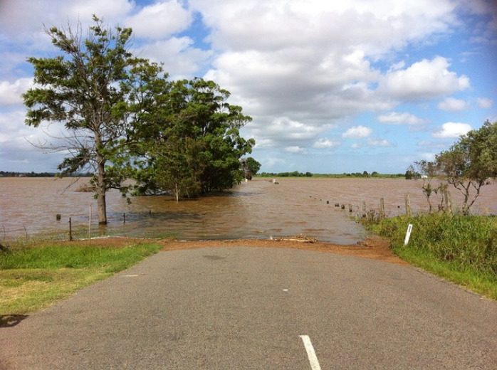
For flooding, distance from moving water is critical. A road that appears shallow can hide washouts, debris, or a strong current. Turning around is safer than testing the depth in a vehicle or on foot. Move toward higher ground if directed and avoid contact with floodwater, which may contain sharp objects, sewage, fuel, or energized electrical equipment. A parked vehicle, basement, or low underpass can become more dangerous as water rises.
In a possible violent incident, observation should not become investigation. Create distance, seek substantial cover when available, silence devices if hiding, and give police a concise description from safety. Do not approach a suspicious person, touch an unknown object, or return to record the scene. Follow responding officers’ commands and keep your hands visible. Information that has not been verified should not be posted publicly because it may misdirect others or disclose the location of people sheltering.
Medical events require a different kind of judgment. Sudden unresponsiveness, abnormal breathing, severe chest pressure, stroke warning signs, major bleeding, serious allergic reaction, or poisoning concerns warrant prompt emergency contact. Use prescribed rescue medication only as directed for the person for whom it was prescribed, and contact Poison Control in the United States for poison guidance when appropriate; call 911 immediately if the person has collapsed, has trouble breathing, has a seizure, or cannot be awakened.
A household should connect the Three first steps during an emergency to local threats. Wildfire zones may require early evacuation routes, coastal areas may need storm-surge decisions, and winter regions may need a plan for power and heating failures. Generic action becomes useful only after it is matched to the warning systems, terrain, building, transportation, and medical needs present where you live.
Practice the First Three Minutes
Short scenario practice makes the opening response easier to retrieve under stress. A useful drill does not require theatrical effects or surprise alarms. Choose a realistic event, announce that it is an exercise, and ask everyone to demonstrate where they would go, who would call, what location information they would provide, and how they would account for other household members. Stop immediately if the drill creates a real safety issue.
Begin with scenarios that expose practical friction. Ask a family member to make a simulated emergency call without looking up the address. Test whether a child can identify two trusted neighbors. Find out whether an apartment number, rural gate, or workplace entrance is visible to responders. Check whether mobility devices, shoes, prescribed medication, and communication aids are reachable without delaying evacuation. These details reveal more than memorizing a long list of supplies.
Compare the planned route with a blocked-route version. If the primary exit contains pretend smoke, can everyone identify an alternate exit without entering another hazard? If cellular networks are unavailable, where is the agreed meeting place and which out-of-area contact can receive status messages? Plans should account for pets, but nobody should delay escape or re-enter a dangerous building to retrieve an animal. Keep carriers or leashes accessible so evacuation can occur efficiently when conditions allow.
After the exercise, correct only the failures that affected safety or communication. A successful drill should show that participants noticed the simulated danger, moved to an appropriate location, communicated the address and hazard, and accounted for people. Warning signs include returning for replaceable property, waiting too long to report the incident, gathering near arriving emergency vehicles, or choosing a meeting place inside the likely hazard area.
Refresh contact details and routes after a move, building renovation, new medical need, or change in household membership. Practical repetition is more valuable than reciting the Three first steps during an emergency without testing them. The goal is not rigid behavior; it is a reliable opening sequence that leaves room for official instructions and changing conditions.
Frequently Asked Questions
Should I call 911 before helping an injured person?
Call as early as conditions allow, especially for unresponsiveness, abnormal breathing, severe bleeding, fire, violence, or another immediate threat. Use speakerphone and follow the dispatcher’s directions if you can assist safely.
What information should I give an emergency dispatcher first?
Give the exact location first, followed by what happened, present hazards, the number of people affected, and their apparent condition. Report changes while remaining on the line.
When should I move an injured person?
Avoid unnecessary movement when the scene is safe. Move someone only when an immediate danger such as fire, traffic, collapse, or contaminated air outweighs the risk of movement, or when a dispatcher directs you.
What if I am unsure whether the situation is a real emergency?
Describe the facts rather than trying to diagnose the event. An immediate threat to life, serious injury, fire, crime in progress, or rapidly worsening condition supports calling emergency services.
How can children learn the first steps safely?
Teach them to move away from danger, identify a trusted adult, state their address, and call the local emergency number when appropriate. Use announced practice calls rather than placing an actual call to emergency services.
Further Reading
Authoritative Sources
Ready.gov ready.gov
Federal preparedness information covers alerts, protective actions, evacuation, sheltering, and hazard-specific planning
Calling 911 911.gov
This federal resource explains when to call 911 and what information an emergency telecommunicator may request
How to Prepare for Emergencies redcross.org
The American Red Cross provides practical material on household plans, alerts, evacuation, and first-aid readiness
Poison Control poison.org
This resource offers poison-exposure guidance and access to poison specialists in the United States
Conclusion
Good emergency decisions begin with a controlled pause, not a reckless rush toward the problem. Identify hazards from a defensible position, send accurate information to the appropriate service, and choose an action proportionate to your training and the threat. Keep monitoring the scene because fire, traffic, weather, structural damage, violence, and a patient’s condition can change quickly.
Next, test the sequence where it will actually be used. Confirm your address and emergency numbers, identify exits and meeting places, and practice a short scenario with every household member. Correct delays, blocked routes, communication gaps, and unsafe assumptions before adding more equipment or a more elaborate plan. A response that protects the caller, communicates the location, and preserves access for responders is more dependable than improvised heroics.
Build Exercises Around Specific Evacuation Decisions
An evacuation exercise needs a defined test objective before anyone activates an alarm. “Practice leaving” is too broad to reveal whether the written procedure works. A useful objective identifies a decision or capability to examine, such as whether occupants recognize two exit routes, whether floor wardens clear assigned spaces, or whether the accountability team can reconcile employees, visitors, and contractors at the assembly area.
The hazard context should shape that objective. A fire scenario may require immediate movement by the nearest safe exit, while a chemical release could make one side of a property unsafe and require direction from incident personnel. Severe weather, smoke, loss of lighting, locked access points, and nearby traffic can change which route or assembly location remains usable. Exercises should reflect credible local conditions without using theatrical effects that create unnecessary risk or confusion.
Begin by defining the exercise boundary. Decide which building areas, shifts, occupants, and outside partners are participating. Record assumptions, including whether elevators are unavailable, whether a primary exit is blocked, and how emergency services will be distinguished from simulated responders. Notify alarm-monitoring services and other affected parties when appropriate so a training event is not mistaken for an actual emergency. Never disable required protection systems merely to make a scenario more challenging.
A compact planning check should cover:
Objective: the action or decision being tested.
Scenario: the condition that triggers evacuation and any simulated obstruction.
Safety controls: stop signals, observer positions, weather limits, and provisions for medical needs.
Participants: occupants, wardens, visitors, accountability personnel, and evaluators.
Success evidence: observable results such as correct route selection and a reconciled attendance record.
A common mistake is combining too many complications in the first drill. Simultaneously blocking exits, simulating injuries, removing communications, and withholding attendee information may create noise rather than insight. A focused exercise gives evaluators a clearer view of cause and effect. Once a basic movement-and-accountability drill works, later Emergency evacuation plan training exercises can isolate harder conditions without overwhelming participants.
Progress From Walkthroughs to Disrupted Drills
Training should progress from explanation to independent performance. New occupants cannot be expected to improvise from a map they have never used, while experienced teams gain little from repeating an announced drill with an unobstructed primary exit. The exercise level should match participants’ familiarity, the building’s complexity, and the consequences of an error.
An orientation or tabletop discussion is the least disruptive starting point. Participants review alarm signals, exits, assembly areas, assigned duties, and procedures for reporting hazards or missing people. A tabletop is particularly useful for supervisors and wardens because they can examine questions that are difficult to resolve during a moving drill: Who brings the visitor log? Who contacts emergency services? Who has authority to relocate an assembly point? Discussion does not demonstrate physical performance, however, so it should not replace an evacuation.
A walkthrough adds movement without the pressure of a full alarm. Small groups follow primary and alternate routes, identify doors that require special operation, and locate the assembly area. This format suits unfamiliar facilities, recently revised floor layouts, and participants who need evacuation assistance. It also exposes practical barriers that look harmless on a plan, such as a route crossing a loading zone or an assembly location too close to responding vehicles.
A scheduled drill then tests coordinated action. Participants respond to the normal alarm or notification method, use the appropriate exits, and report for accountability. Observers should avoid coaching unless they see an unsafe act. If a person turns toward a familiar entrance instead of the nearest safe exit, that decision is valuable evidence about signage, habit, or incomplete instruction.
More advanced exercises introduce one controlled disruption. For example, an observer may mark the usual stairwell as unavailable and watch whether occupants select the documented alternative. Another drill might occur during a shift change, when rosters are least reliable. Unannounced exercises can test recognition and readiness, but they also create added risk for people with medical, mobility, sensory, or anxiety-related needs. They should be used only after baseline training, careful coordination, and suitable safety controls.
Progression is working when participants need less prompting, alternate routes are selected without unsafe hesitation, and assigned personnel perform their roles even when conditions change. It is failing when speed improves only because people ignore accountability, hold open protected doors, use prohibited routes, or assume a familiar alarm is “just another drill.”
Test Routes, Assistance, Communication, and Accountability
A credible drill examines the entire chain from warning to confirmed accountability. Measuring only the time required to reach an exterior door can reward unsafe behavior and conceal serious gaps. The more useful question is whether everyone received actionable information, moved by a viable route, reached a safe assembly point, and was accurately reported.
Route Selection and Movement
Observers should note congestion, hesitation, attempts to retrieve belongings, and doors that do not operate as participants expect. They should also watch whether people close doors when the plan requires it and keep access clear for responders. Timing can help identify bottlenecks, but a faster time is not automatically better. A controlled movement that protects people on stairs and avoids counterflow is preferable to rushing that causes falls or separates groups.
Route exercises should cover more than the primary path. Consider a workplace where most employees habitually enter through a front lobby, although two side exits are closer to their work areas. If everyone heads for the lobby during a drill, the issue may be behavioral familiarity rather than inadequate exit capacity. Marking the lobby route unavailable during a later exercise can test whether signs, maps, and instruction have made the alternatives usable.
Assistance and Communication
People who may need assistance should be included in planning without making assumptions about what they can do. Discuss preferred assistance, backup personnel, refuge procedures where applicable, mobility-device considerations, and communication methods before the drill. Plans must account for temporary limitations as well as known disabilities. A worker using crutches after an injury or a visitor unfamiliar with the alarm may need support even when the regular roster shows no accommodation requirement.
Communication should be tested under realistic noise and distance. Spoken directions that work in a quiet meeting may fail near machinery or outdoors. Visual notifications, public-address messages, text systems, radios, and face-to-face instructions serve different audiences and may fail in different ways. The exercise should verify who issues updates and how assembly leaders receive changes, not merely whether a message was sent.
Accountability Beyond a Head Count
Accountability requires a reliable expected-person list, a reporting method, and a process for resolving discrepancies. Employee rosters alone often omit visitors, contractors, remote staff, people at lunch, or workers who moved between departments. Assembly leaders should report missing or extra individuals through a defined channel rather than sending anyone back inside to search.
A practical set of Emergency evacuation plan training exercises should rotate accountability complications. One event might include a simulated visitor whose host has evacuated to another assembly point. Another might remove a roster runner and require the designated backup to act. These scenarios reveal whether the process depends on one person’s memory—a fragile arrangement that can fail during leave, injury, or shift changes.
Evaluate Performance and Correct Weak Points
Evaluation should connect observed behavior to a corrective decision. Comments such as “people were confused” or “the drill went well” are too vague to change the plan. Evaluators need to record where an issue occurred, what participants did, what condition influenced the behavior, and what consequence could follow during a real evacuation.
Use observers at decision points rather than clustering them at the assembly area. Useful locations include major intersections, stair entrances, exterior discharge doors, accessible egress areas, and roster collection points. Each observer should have a narrow assignment so observations remain comparable. One may record route choices while another tracks the time and accuracy of accountability. Photos or video may assist review only when organizational policy, privacy expectations, and site security allow their use.
Debrief immediately enough that details remain fresh, but do not let senior voices dominate. Ask participants what alarm they perceived, why they selected a route, where instructions became unclear, and what prevented them from completing an assigned role. A person who used the wrong exit may reveal that a sign was hidden by an open door; simply labeling the behavior “noncompliance” would miss the physical cause.
Corrective actions should be prioritized by safety consequence and operational dependency. A blocked exit, failed alarm device, or missing accommodation procedure warrants more urgent attention than a slightly delayed roster handoff. Each action needs an owner, a target date, and a verification method. Possible remedies include repairing hardware, relocating an assembly point, revising maps, updating visitor controls, clarifying backup assignments, or providing focused retraining.
Do not rewrite the entire plan after every imperfect drill. Some errors come from unfamiliarity and are better addressed through instruction; others expose a flawed procedure or facility condition. Compare the written expectation with what was physically possible. If trained participants repeatedly make the same reasonable choice, the plan may be working against the building layout or normal human behavior.
Close the cycle with a retest. If the first drill found inaccurate contractor records, the next exercise should verify the revised check-in and accountability process rather than merely repeating the evacuation. Keep exercise reports concise enough to use: objective, scenario, observations, safety concerns, corrective actions, owners, deadlines, and retest results. That record turns Emergency evacuation plan training exercises into a continuing validation process rather than a calendar obligation.
Frequently Asked Questions
How often should evacuation exercises be conducted?
Frequency should reflect applicable requirements, occupancy risks, staff turnover, operational changes, and previous drill findings. Retest promptly after correcting a serious weakness instead of waiting for the next routine exercise.
Should an evacuation drill be announced in advance?
Announced drills are appropriate for initial training and unfamiliar participants. Unannounced drills may test readiness later, but only with advance safety coordination and provisions for people who could be placed at risk.
Is evacuation time the best measure of success?
No. Time is useful for identifying delays, but route safety, alarm recognition, assistance, communication, and accurate accountability matter more than achieving the fastest exit.
Who should observe an evacuation exercise?
Use personnel who understand the plan but do not have conflicting response duties. Place them at route junctions, stairs, exits, assembly areas, and accountability stations with defined observation tasks.
When should a drill be stopped?
Stop or suspend it for an actual emergency, injury, dangerous crowding, severe weather, unsafe traffic interaction, or any condition beyond the exercise’s safety controls. Participants should know the stop signal beforehand.
Further Reading
Authoritative Sources
OSHA Evacuation Plans and Procedures eTool osha.gov
Explains workplace evacuation planning elements, alarm considerations, exit routes, and responsibilities that can be tested during exercises
OSHA Emergency Preparedness: Getting Started osha.gov
Provides official workplace preparedness context for evaluating hazards, plans, training, and employee protection
Ready.gov Business Emergency Plans ready.gov
Offers planning considerations for warnings, protective actions, communications, and exercises in organizational settings
Ready.gov Evacuation ready.gov
Summarizes practical evacuation planning issues, including routes, destinations, communications, and individual needs
Conclusion
Useful evacuation exercises test decisions, physical movement, communication, assistance, and accountability as one connected process. Begin with a narrow objective and an announced walkthrough, then add controlled complications only after participants can perform the basic procedure safely. Evaluate behavior at route choices and assembly points rather than relying on elapsed time alone.
The next practical step is to select one high-consequence weakness in the current plan and design an exercise around it. Assign observers, define stop conditions, include visitors and people needing assistance, and document what happens. Give every corrective action an owner and verification date, then retest the changed procedure. A plan becomes dependable through repeated evidence that people can use it under changing conditions—not through a successful drill that avoided its hardest assumptions.
The best exercise scenario reflects a disruption the community could plausibly face and a decision its members may need to make together. A neighborhood association might simulate an extended power outage during extreme heat, while a faith community could practice accounting for people after a building evacuation. A civic club that operates a meeting hall may get more value from a severe-weather shelter exercise than from an elaborate disaster simulation involving agencies it does not control.
Keep the scenario narrow enough to expose decisions within an hour. “A major disaster has occurred” gives participants little operational direction. “Electricity has been out for four hours, mobile service is intermittent, and the cooling center two miles away is open” creates specific questions: Who needs a welfare check? Which information is confirmed? Can members travel safely? Who has mobility, language, medical-device, or transportation needs? The details should create choices without scripting the answers.
Exercise design also needs a clear boundary between group responsibilities and professional response. Participants can practice notification, accountability, basic first aid within their training, and referral to public services. They should not imitate structural entry, utility repair, medical diagnosis, traffic control, or other hazardous duties. Calling emergency services, following official instructions, and staying out of unsafe areas are valid exercise decisions—not signs that the group failed.
A practical scenario statement should identify the location, time, immediate conditions, unavailable services, and one developing complication. For example, a community center loses power on a hot afternoon while 35 people are present. Ten minutes later, the facilitator reports that the usual exit is blocked and one attendee cannot use stairs. That complication tests whether the group knows an accessible alternate route rather than merely recognizing the need to leave.
A common mistake is selecting a dramatic event that overwhelms the group’s actual authority. Complex scenarios may generate energetic discussion but little transferable learning. For a first Emergency preparedness activity for community groups, choose one location, one operational period, and three or four decisions. More advanced groups can later add missing leaders, damaged facilities, conflicting reports, or a second operational site.
Prepare Roles, Materials, and Safety Boundaries
Good preparation gives participants enough structure to act without revealing the expected solution. Name a facilitator who controls the scenario, a timekeeper, and at least one observer who does not make decisions for the group. Everyone else should receive a functional assignment tied to the community’s real capabilities. Useful assignments include group coordination, member accountability, communications, accessibility support, facility checks from a safe location, and resource tracking.
Roles should have backups because the usual leader may be absent during an actual disruption. Pairing a primary and alternate also reveals whether knowledge is concentrated in one person. If only the association president can access the contact list or only one volunteer knows where the battery radio is stored, the drill has already identified a fragile dependency. Access to sensitive contact details should remain limited, and exercise copies should be collected or securely handled afterward.
Prepare a small exercise packet rather than a thick manual. It can include a participant roster using exercise-safe information, a site map, blank message forms, role cards, and a page for recording decisions. Mark all simulated messages clearly so no one mistakes them for a real warning. Participants may use their normal radios, phone trees, group messaging systems, printed lists, or runners, but they should not contact emergency dispatchers merely to test the scenario.
Before starting, state the safety rules in plain language. Real emergencies override the exercise. No participant should enter a restricted area, move heavy objects, climb, handle live utilities, or perform care beyond their training. Participation should also accommodate mobility, sensory, cognitive, language, and health-related needs. Someone who cannot perform a physical task can serve as a communicator, recorder, observer, or decision-maker rather than being excluded.
Use this compact readiness check before the session:
Objective: Identify one or two abilities being tested, such as accounting for members and distributing verified updates.
People: Assign a facilitator, observers, role holders, and alternates.
Materials: Prepare maps, rosters, role cards, message forms, and visible “exercise only” labels.
Boundaries: Explain prohibited actions, privacy controls, and how to stop the drill.
Debrief: Reserve at least 15 minutes and name someone to document improvements.
The main preparation failure is confusing equipment display with capability. A table covered with radios and first-aid kits does not show that people can communicate under pressure or locate supplies in low light. Test ordinary procedures with the resources the group truly maintains. If the activity requires borrowed gear, ideal attendance, or an organizer feeding every answer, it is demonstrating a special event rather than community readiness.
Run the 60-Minute Community Drill
A disciplined timeline keeps the exercise active while leaving enough room for reflection. Use the first five minutes for safety instructions, objectives, and role assignments. Spend approximately 30 minutes on the scenario, introduce one or two complications during that period, and preserve the final 20 to 25 minutes for immediate observations and corrective actions. Facilitators should adjust the pace if a safety concern, accessibility issue, or genuine emergency arises.
Open with a factual situation report rather than a long narrative. Tell participants what has happened, which services are affected, what official information is available, and what remains unknown. The group should then establish who is coordinating, account for participants, identify urgent needs, and select a reliable method for sharing updates. Observers should note elapsed time and visible actions. They should not quietly solve problems or penalize people for taking a different but safe approach.
Complications, sometimes called scenario updates, should test the stated objective. If the goal is resilient communication, announce that mobile data has failed and ask the group to continue. If the goal is inclusive evacuation, report that a participant needs an accessible route and that the nearest exit cannot be used. Avoid piling on unrelated injuries, weather changes, missing children, and building damage at once. Too many problems make it impossible to determine which process worked and which one failed.
Consider a neighborhood power-outage example. The coordinator receives an update that a nearby cooling location is operating, but the message comes from an unverified social account. The communications lead checks an official local source before the group circulates the address. Meanwhile, accountability volunteers discover that two residents who normally need transportation have not replied. Rather than promising rescue, the group follows its established welfare-check procedure and identifies the point at which public safety or social services should be contacted.
Signs the exercise is working include concise status updates, visible tracking of who has been contacted, clear handoffs, alternate communication methods, and decisions tied to verified conditions. Warning signs include several people issuing instructions, private information being read aloud unnecessarily, participants acting on rumors, or no one documenting decisions. Silence can also reveal confusion rather than calm; the facilitator may ask, “Who currently has coordination responsibility?” without telling the group whom to select.
The facilitator should pause the activity if participants attempt an unsafe action or if the scenario becomes emotionally distressing. Otherwise, allow manageable mistakes to continue long enough for their consequences to become visible. A delayed roster check teaches more when participants notice that nobody can confirm who remains in the building. The aim of an Emergency preparedness activity for community groups is not a flawless performance. It is observable evidence about procedures that will need to function without coaching.
Debrief the Exercise and Correct Weak Points
The debrief determines whether the drill produces improvement or becomes a memorable meeting with no lasting effect. Begin immediately, while decisions and communication gaps remain fresh. Ask participants what they expected to happen, what actually happened, and what made the difference. Observers should report behavior they saw—such as a six-minute delay in locating the roster—rather than assigning blame or speculating about a person’s motives.
Discuss strengths before deficiencies, but require evidence for both. “Communication was good” is too vague to preserve. “The radio operator repeated the destination and received confirmation from both teams” identifies a practice worth retaining. Likewise, replace “the evacuation was disorganized” with a precise finding: participants reached the alternate door, but no one checked whether the route was accessible or whether all rooms had been cleared.
Sort findings by consequence and effort. A missing method for accounting for people is more urgent than inconsistent formatting on a supply sheet. A contact list that can be corrected during the next meeting should not remain open for months. Larger issues, such as modifying an accessible route or arranging backup power for essential communications, may require authorization, funding, property-owner involvement, or professional assessment. Recording those constraints prevents the group from pretending that every weakness has a quick volunteer solution.
Each corrective action needs four elements: a specific change, a named owner, a target date, and a way to verify completion. “Improve communications” is not actionable. “The communications coordinator will print two updated call-tree copies, store them in approved locations, and test the alternate notification method at next month’s meeting” can be checked. Protect personal data when updating rosters, and obtain appropriate permission before sharing names, phone numbers, health details, or assistance needs.
Repeat only the part that failed rather than rerunning the full hour immediately. If conflicting leadership caused delay, conduct a ten-minute role-transfer exercise. If messages were distorted, practice sending and confirming a short situation report. A later full drill can determine whether separate corrections work together. This progression costs less time and gives quieter or newer members a chance to build competence before a more demanding scenario.
The clearest evidence of progress appears in changed behavior: alternates can find the materials, messages reach the intended recipients, accountability records stay current, and participants know when to defer to official responders. Repeated confusion about the same task indicates that the correction was unclear, inaccessible, or never implemented. Document the result, revise the procedure, and schedule the next Emergency preparedness activity for community groups around the unresolved weakness rather than choosing a new theme for variety.
Frequently Asked Questions
How many people are needed for a community preparedness drill?
Six to twelve participants can test coordination, communication, and accountability effectively. Larger groups should use small functional teams and additional observers so everyone has a defined role.
Should emergency services participate in the activity?
Invite local emergency management or public safety representatives when available, but do not make their attendance a requirement. Never contact emergency dispatch during a simulation unless an actual emergency occurs.
What scenario works best for a first exercise?
Choose one familiar location and a plausible disruption such as a power outage, severe-weather warning, or blocked exit. Test only two capabilities, such as notification and accountability.
How often should a community group conduct a drill?
Schedule exercises often enough to test staff or volunteer turnover, updated contact information, and corrected procedures. Short practice sessions between larger drills can address specific weaknesses without exhausting participants.
How can the activity include people with disabilities?
Ask participants what support and communication formats they prefer, use accessible locations and routes, and offer meaningful physical and nonphysical roles. Do not assume a diagnosis determines what assistance someone needs.
Further Reading
Authoritative Sources
Community Preparedness Toolkit ready.gov
Federal preparedness material for organizing community-level planning, outreach, and local resilience activities
Community Emergency Response Team Program community.fema.gov
Official information about CERT training and the appropriate role of trained community volunteers
Homeland Security Exercise and Evaluation Program fema.gov
Exercise-development and evaluation doctrine that can inform objectives, observation, debriefing, and corrective actions
How to Prepare for Emergencies redcross.org
Practical preparedness information that groups can use to reinforce individual and household readiness alongside community exercises
Conclusion
A productive community exercise tests a small number of decisions under believable conditions and turns observed weaknesses into assigned work. Begin with a local scenario, define safe limits, distribute functional roles with alternates, and let participants use the communication methods and materials they would actually have. During the drill, record what people do rather than what planners hoped they would do.
The next step is to choose one location and two capabilities for a 60-minute session. Prepare a brief scenario, roster, map, role cards, and exercise-only messages, then reserve adequate time for the debrief. Finish by assigning owners and dates to the most consequential corrections. A shorter follow-up can verify individual fixes before the group attempts a more complex event.
Define Activation Thresholds and Immediate Priorities
A usable plan distinguishes a minor injury from a potentially life-threatening event before anyone is forced to make that distinction under stress. Activation criteria should be written in observable terms: uncontrolled or severe bleeding, absent or abnormal breathing, loss of consciousness, a seizure, chest pain, signs of stroke, a severe allergic reaction, major burns, or a suspected head, neck, or spinal injury. When the severity is uncertain, calling emergency services is generally safer than delaying while untrained responders debate a diagnosis.
The first responder’s initial job is not to identify every injury. It is to check whether the scene is safe, determine whether the person is responsive and breathing normally, call for appropriate help, and provide care within current training. A damaged electrical cord, moving machinery, traffic, fire, unstable debris, or violent behavior can turn one casualty into several. The plan should explicitly state that responders do not enter an unsafe area unless they are trained, equipped, and authorized to manage that hazard.
Priorities should follow the threats that can cause rapid deterioration. Severe external bleeding may require firm direct pressure and, when indicated, a commercially manufactured tourniquet used by someone who understands its application. An unresponsive person who is not breathing normally may need CPR and an automated external defibrillator. A conscious person with a suspected spinal injury generally should not be moved unless remaining in place exposes the person to a more immediate danger. These actions are not interchangeable; the observed condition determines the response.
Consider a fall from a ladder in a workshop. A weak plan tells someone to “provide first aid.” A functional plan directs one person to stop nearby equipment, another to call 911 with the correct entrance and access instructions, and a trained responder to assess breathing and serious bleeding without unnecessarily moving the injured person. If the person is beneath an unstable load, hazard control may take priority over close contact.
A compact activation sequence can keep the opening minutes focused:
Protect: Identify immediate hazards and use appropriate protective barriers.
Assess: Check responsiveness, normal breathing, and obvious life-threatening bleeding.
Alert: Call 911 or the applicable local emergency number and send someone to guide responders.
Assist: Give only the care supported by the responder’s training and available equipment.
The common failure is treating the written procedure as permission to exceed one’s competence. An action plan organizes qualified help; it does not turn an untrained person into a clinician. Review Injury emergency action plan essentials whenever the site, staffing, hazards, or available medical resources change.
Assign Roles That Work Under Pressure
Named responsibilities reduce duplicated effort and unattended tasks. At minimum, the plan should identify an incident lead, a caller, a first-aid responder, an equipment runner, and a person who meets emergency personnel. In a small household or work crew, one individual may hold several roles, but the order of those duties must be explicit. Calling for advanced help should not wait until every other task is complete.
The caller needs more than an instruction to dial 911. A concise call script should include the street address or precise location, the nature of the injury, the number of injured people, known hazards, the caller’s telephone number, and the best access point. The dispatcher may give instructions or ask the caller to stay on the line. Someone should therefore be prepared to use speakerphone while another trained person provides care, provided doing so does not interfere with safety.
Access duties are especially important at farms, camps, warehouses, apartment complexes, and remote properties. A street address may lead responders to a locked gate or the wrong side of a large site. Record gate codes, building names, floor numbers, trail markers, coordinates where reliable, and landmarks that remain visible at night or in poor weather. The designated guide should carry a phone and, when safe, wait where arriving personnel can see them.
For example, during a youth activity on a large field, the nearest adult may begin assessment while a second adult calls emergency services. A third retrieves the first-aid kit and AED, and a fourth sends bystanders away from the access lane. If every adult crowds around the injured participant, no one may notice that the ambulance entrance is chained. Role separation solves an operational problem, not merely an administrative one.
Alternates are necessary because the primary responder may be absent, injured, or directly involved in the incident. Assign roles by position as well as by name, such as “shift supervisor” or “front desk attendant,” and keep an updated contact roster. Children, visitors, temporary staff, and people with limited mobility may require specific assistance, but private health information should be shared only as needed and handled according to applicable policies.
A frequent mistake is assigning a medical role to the most senior person rather than the person with current skills. Leadership authority and first-aid competence are different. Confirm who has current CPR, AED, first-aid, or bleeding-control training, then position equipment and backup personnel around actual coverage. The role structure is working when every essential task has an owner and no critical duty depends on one irreplaceable person.
Match Equipment and Location Information to the Setting
Supplies should reflect credible injuries at the specific location, not an oversized collection of unfamiliar products. A basic response station commonly needs protective gloves, dressings, gauze, medical tape, a CPR barrier, an instant cold pack, trauma shears, and clear instructions. Settings with machinery, glass, cutting tools, or long response times may justify dedicated bleeding-control supplies. An AED should be accessible where cardiac emergencies are plausible and where trained or willing responders can retrieve it quickly.
Accessibility matters as much as inventory. A locked cabinet, an unmarked storage bin, or a kit kept in a vehicle that is routinely off-site creates false readiness. Mark supply locations, keep routes unobstructed, and ensure that people can reach equipment during the hours the site is occupied. If supplies may be exposed to moisture, dust, heat, freezing temperatures, or tampering, use suitable storage without making access needlessly difficult.
Inspection should cover more than expiration dates. Check packaging integrity, depleted quantities, battery status where applicable, legible labels, and whether specialty items still match responder training. Prescription medication ordinarily belongs to the person for whom it was prescribed and should not be treated as a general first-aid supply. The plan should avoid improvised treatments or medications that require clinical judgment unless qualified personnel and an appropriate protocol are present.
A remote cabin illustrates the tradeoff between more equipment and more capability. Extra dressings, blankets, communication backups, and written coordinates may be useful when ambulance arrival will take longer. Advanced airway devices or surgical tools, however, add little value without the training and authorization to use them. In remote settings, early communication, accurate location data, weather awareness, and a realistic evacuation decision may matter more than carrying complex gear.
Post the address and location instructions beside fixed phones, kits, and radios. Mobile callers under stress may know the property but forget a road number, unit designation, or gate code. Where cellular service is unreliable, identify tested alternatives such as a landline, radio procedure, or appropriate satellite communication device. A communication backup is credible only after someone has tested coverage, power requirements, contact procedures, and the view of the sky where relevant.
The recurring failure mode is purchasing supplies without integrating them into the response. Connect each item to a trained user, an inspection interval, and a credible injury. A practical Injury emergency action plan essentials review should ask three questions: Can responders find it, is it ready to use, and does anyone know how to use it safely?
Practice the Response, Handoff, and Follow-Up
Exercises reveal delays that a written review cannot expose. A short scenario can test whether someone recognizes the activation threshold, calls from the actual location, retrieves equipment, clears the access route, and transfers useful information to arriving professionals. The drill should measure actions and obstacles rather than reward memorized wording. A person who can describe the plan but cannot locate the AED has not demonstrated operational readiness.
Use plausible scenarios tied to the setting. A household might practice a garage laceration while one adult is away. A workshop could test a hand injury near energized equipment. A hiking group could rehearse a fall where cellular coverage is intermittent. Do not simulate dangerous physical actions, apply real tourniquets tightly to participants, or delay an actual emergency for the sake of following a drill script. Training props and verbalized actions can test coordination without creating injury.
The handoff to emergency medical personnel should be brief and factual. Report what happened, when it happened, changes in responsiveness or breathing, major bleeding, relevant known medical information, and care already provided. Preserve medication containers or product labels when poisoning or exposure may be involved, but do not endanger anyone to retrieve them. One person should speak for the group so responders are not forced to reconcile several conflicting accounts.
After an incident, replace opened supplies, document required facts, and review the response while details are fresh. Documentation may include the time the injury was discovered, who was notified, observed conditions, care provided, and when emergency personnel assumed responsibility. Avoid speculation, blame, or an amateur diagnosis. Organizations should follow their own reporting requirements and applicable rules for privacy, workplace incidents, safeguarding, or notification.
A useful debrief separates plan defects from individual mistakes. If the caller gave the wrong entrance because the posted map was outdated, correcting the map is more valuable than simply telling the caller to do better. If nobody retrieved the kit because two people assumed the other had done it, the role assignment needs clearer confirmation. If responders could not hear each other near machinery, the communication method needs revision.
Signs of a functioning plan include rapid recognition, an unambiguous call for help, equipment arriving with the appropriate responder, and a controlled access route. Warning signs include confusion over authority, missing supplies, an unattended caller, unsafe movement of the injured person, or conflicting directions. Schedule practice after staffing or layout changes and periodically enough that assigned people remember their duties. Update Injury emergency action plan essentials based on observed friction rather than assuming a completed form remains accurate.
Frequently Asked Questions
Who should activate an injury emergency action plan?
Anyone who observes a potentially serious injury should be authorized to call for help. The plan may name a lead responder, but it should not require waiting for a manager before contacting emergency services.
When should 911 be called for an injury?
Call for severe bleeding, abnormal or absent breathing, loss of consciousness, suspected stroke or spinal injury, major burns, severe allergic reactions, or any condition that appears life-threatening. Follow the dispatcher’s instructions.
How often should the plan be practiced?
Practice periodically and after meaningful changes to personnel, site access, hazards, communications, or equipment. The interval should reflect the setting’s risk and staff turnover rather than an arbitrary calendar date.
What information should be given to emergency medical services?
Provide the exact location, access instructions, injury mechanism, number of patients, observed condition, known hazards, and care already given. Answer questions directly and remain available unless the dispatcher says otherwise.
Should an injured person be moved?
Avoid unnecessary movement when head, neck, back, or major limb injury is suspected. Movement may be necessary if fire, traffic, structural instability, or another immediate threat makes the current location more dangerous.
Further Reading
Authoritative Sources
American Red Cross First Aid Training redcross.org
Provides information about first-aid, CPR, and AED training for people assigned to injury-response roles
OSHA Medical and First Aid osha.gov
Explains federal workplace resources related to medical services, first aid, and emergency readiness
CDC STOP THE BLEED cdc.gov
Offers public information about recognizing life-threatening bleeding and obtaining appropriate response training
Ready.gov Emergency Plans ready.gov
Provides planning considerations for communications, responsibilities, continuity, and emergency procedures
Conclusion
A credible injury response depends on decisions made before the incident: which conditions trigger outside help, who performs each task, where supplies are stored, and how responders reach the exact location. Build the procedure around observable hazards and current training rather than assumed medical skill. Then test it from the place where an injury is likely to occur, using the phones, entrances, equipment, and personnel that would actually be available.
Correct practical failures immediately. Replace missing supplies, update access details, designate alternates, and retrain anyone whose role exceeds their competence. The next step is a short scenario drill followed by a factual debrief. If participants cannot summon help, retrieve equipment, protect the scene, and provide a clear handoff without confusion, the plan needs revision before it can be trusted.
Illinois does not publish a single mandatory household kit inventory that every resident must own. State emergency-management materials encourage personal readiness, but preparedness recommendations for private homes are different from enforceable rules governing particular workplaces, schools, childcare operations, healthcare settings, or licensed facilities. A resident should therefore treat a household supply list as practical risk management rather than proof of legal compliance.
That distinction matters when someone asks whether a kit is “required.” A family assembling water, food, flashlights, and medication is addressing its ability to function during an outage, severe storm, flood, or evacuation. A business evaluating compliance may instead need to examine fire codes, occupational safety duties, building rules, licensing standards, or an emergency action plan. Purchasing a commercially labeled survival kit does not establish that those separate obligations have been met.
Jurisdiction can change the answer as well. Municipal authorities, fire departments, building managers, employers, and program regulators may impose rules that do not apply statewide to all households. Apartment leases or workplace procedures can also identify assembly locations, shelter areas, or evacuation methods without dictating a personal supply inventory. Anyone responsible for an organization should verify the rules attached to that organization rather than relying on a general consumer article.
For household planning, the sound approach is to use official recommendations as a baseline and then account for the people, animals, climate, building, and transportation involved. The phrase Illinois emergency preparedness kit requirements should not be interpreted as a fixed shopping list that works equally well in Chicago, a rural township, or a flood-prone river community. The operational question is whether the household can communicate, stay warm or cool enough, manage essential health needs, and leave safely if services are interrupted.
A common mistake is equating “not universally mandated” with “not necessary.” Utility failures and transportation interruptions can restrict access to groceries, pharmacies, fuel, elevators, and electronic payments even when no evacuation order is issued. The practical standard is readiness for plausible disruptions, while the compliance standard must be checked with the agency or authority responsible for the specific property or operation.
Supplies That Belong in an Illinois Kit
A useful Illinois kit should preserve hydration, calories, communication, light, basic hygiene, and continuity of personal care. Each category needs a clear purpose. Water and ready-to-eat food cover interruptions to utilities and shopping; batteries and radios provide information when internet or cellular service is unreliable; medications and medical supplies address needs that cannot wait for stores to reopen.
Build the kit around functions rather than buying an opaque bundle. A preassembled kit may provide a flashlight, blanket, or first-aid components, but it rarely includes prescription medicine, properly sized clothing, infant supplies, pet equipment, spare eyeglasses, mobility-device accessories, or food a household member can safely eat. Open any commercial package, inspect its contents, and replace low-value duplicates with items matched to the users.
Water and food: Potable water, nonperishable foods, a manual can opener when needed, and utensils. Choose foods that require little water or cooking.
Health and sanitation: Prescription planning, first-aid supplies, masks, soap or sanitizer, toilet paper, menstrual products, and necessary medical-device supplies.
Light and information: Flashlights or headlamps, spare batteries, a battery-powered or hand-crank radio, charging cables, and power banks.
Protection and access: Seasonal clothing, sturdy footwear, blankets, work gloves, basic tools, cash in practical denominations, and copies of critical information.
Household-specific items: Infant feeding supplies, pet food and carriers, hearing-aid batteries, communication aids, and backup power arrangements appropriate for essential devices.
Water deserves deliberate planning because it is heavy, takes space, and may be needed for drinking, limited food preparation, and certain care tasks. Official guidance commonly uses one gallon per person per day as a planning baseline, but individual consumption, heat, illness, pregnancy, pets, and sanitation needs can increase demand. Store only containers intended for water, protect them from contamination and temperature extremes, and follow the container or water provider’s instructions for replacement.
Medication planning has constraints that generic lists often ignore. Do not place medicines in a hot vehicle or stock extra prescriptions without consulting the prescriber, pharmacist, insurer, and applicable rules. Instead, maintain an updated medication list, understand refill timing, preserve required refrigeration where feasible, and identify backup contacts. A written list remains accessible when a phone battery dies.
The kit is working when every item has a user and purpose. It is failing when food cannot be opened, batteries do not match devices, family members cannot lift the bag, or essential supplies are scattered across inaccessible locations. Those checks make Illinois emergency preparedness kit requirements a usable household system rather than a one-time purchase.
How to Size and Store the Kit
Illinois households benefit from separating shelter-at-home supplies from evacuation supplies. A home reserve can hold more water, food, bedding, sanitation materials, and backup power than anyone could reasonably carry. A portable bag should emphasize identification, medicine, communication, immediate food and water, weather protection, and the items needed during the first stage of relocation.
Start by counting people and pets, then identify needs that occur daily or on a schedule. A household of four does not merely need four copies of a generic list. One member may use refrigerated medicine, another may need formula, and a dog may require a leash, carrier, records, and food. Document those dependencies before calculating quantities. The most consequential gap is often a personalized item that a retail kit could never anticipate.
Storage location affects whether supplies can be reached. Basement storage may be spacious but vulnerable to water intrusion. An attached garage offers quick access but may experience damaging temperature swings. An upper closet protects against some flood exposure but may be difficult to reach for a person with limited mobility. Use sealed, clearly labeled containers and divide critical items between sensible locations when one hazard could block access to all of them.
A practical arrangement uses three layers. Keep everyday necessities such as medicine, phones, and mobility aids integrated into daily routines. Maintain a portable bag near an exit without obstructing the route. Store the larger home reserve in a cool, dry, accessible place. Vehicle supplies can add warmth, visibility, and short-term support during winter travel, but a vehicle should not be the sole storage site for temperature-sensitive food, water containers, batteries, or medicine.
Documents require restraint as well as accessibility. Keep emergency contacts, insurance details, medication information, pet records, and identification copies protected from moisture. Avoid leaving unprotected sensitive records in a vehicle or an easily stolen bag. An encrypted digital backup may complement paper copies, but it should not be the only method because power, passwords, or network access may fail.
A common failure is creating one container that is too heavy to move. Test the loaded bag on the person expected to carry it, through the actual exit and to the likely transportation point. If it is unmanageable, remove low-priority gear, split shared supplies among capable household members, or use a wheeled container where terrain permits. A smaller bag that reaches the vehicle or shelter is more useful than a comprehensive cache left behind.
Illinois Hazards That Change the Contents
Illinois weather and geography make seasonal customization more valuable than a static kit. Severe thunderstorms, tornadoes, flooding, winter storms, extreme temperatures, and extended outages create different demands. The baseline supplies remain useful, but location and season determine what should be added, protected, or kept immediately accessible.
For a tornado warning, the first priority is reaching an appropriate shelter area quickly, not gathering equipment from several rooms. Keep sturdy shoes, a flashlight, weather information, basic first aid, and protective items in or beside the shelter location. Shoes matter because broken glass and debris may cover the route out. A basement kit should be stored above likely seepage and protected in a water-resistant container.
Flood preparation requires a different storage decision. Residents near rivers, low-lying roads, or drainage trouble should avoid placing all food, documents, power banks, and medicines at floor level. Evacuation routes may close before water reaches the home, so fuel planning, alerts, and early movement can matter more than adding another tool to a bag. Never treat emergency supplies as justification for entering or driving through floodwater.
Winter vehicle readiness emphasizes warmth and visibility. A blanket, layered clothing, hat, gloves, flashlight, phone power, scraper, and reflective warning equipment can be useful if travel stops. Food should be easy to eat without heating. Water needs protection against leakage and freezing damage. The safer comparison is not “car kit versus no car kit,” but a car kit combined with travel decisions based on forecasts, road conditions, fuel, and the vehicle’s condition.
Urban high-rise residents should plan for stairs, elevator loss, building communications, and limited carrying capacity. Rural households may face longer restoration times, greater driving distances, well-pump loss during an outage, and weaker cellular coverage. Someone relying on an electrically powered well needs stored water; someone in a high-rise may prioritize a lightweight evacuation load. The correct contents follow the consequences of the local disruption.
Seasonal review prevents yesterday’s solution from becoming tomorrow’s gap. Rotate cold-weather layers into the vehicle before winter, check cooling and hydration options before summer, and update shelter locations and alert settings during severe-weather seasons. The mistake to avoid is preparing for the most dramatic scenario while overlooking recurring power, travel, and communication failures.
Maintenance and Readiness Checks
An emergency kit remains dependable only when its contents are inspected, usable, and familiar to the household. Food ages, batteries discharge, clothing sizes change, prescriptions are updated, contact numbers become obsolete, and power banks lose charge. A sealed container that has not been opened for years offers uncertain readiness.
Set a recurring review tied to a memorable schedule and add an inspection after any use. Check package condition and manufacturer dates rather than assuming every product follows the same replacement period. Look for corrosion, swelling, leaks, moisture, pests, broken seals, or heat damage. Replace compromised items immediately and rotate suitable food into normal household use before quality declines.
Testing should cover actions, not merely inventory. Confirm that flashlights operate, radio reception is adequate, charging cables fit current devices, and everyone knows how to receive local alerts. Walk the primary exit, identify an alternate route, and verify where household members would reconnect if separated. If a person cannot locate the kit in darkness or open its closures, reorganize it.
Use a compact readiness check:
Verify water, food, medicine planning, and sanitation supplies for current household members and pets.
Charge power banks and test lights, radios, alarms, and compatible batteries.
Update contacts, health information, meeting points, and document copies.
Adjust clothing and hazard-specific supplies for the coming season.
Lift or move each portable container and correct any access or weight problem.
Signs of a sound system include supplies that can be reached without searching, clear ownership of recurring checks, and equipment household members have actually tested. Warning signs include expired or unidentified items, a bag no one can carry, dependence on a single phone, and no accommodation for medicine, disability, pets, or seasonal exposure.
Household reviews do not replace organizational compliance assessments. A manager, provider, or operator should compare the applicable rules with the actual site, staff, occupants, and emergency procedures. For private residents, the better measure is whether Illinois emergency preparedness kit requirements have been translated into realistic supplies, accessible storage, and practiced decisions.
Frequently Asked Questions
Is an emergency preparedness kit legally required in every Illinois home?
No universal Illinois rule requires every private household to own the same kit. Official supply recommendations remain valuable, while regulated facilities and workplaces may face separate requirements.
How many days of supplies should an Illinois household store?
Plan for a multiday disruption and expand the reserve when space, budget, health needs, or local risks justify it. Follow current official guidance and size supplies for every person and pet.
Should water be kept in a vehicle kit?
A modest vehicle supply can be useful, but freezing and summer heat may damage containers or reduce reliability. Inspect it frequently and keep the main water reserve in protected home storage.
Does a commercial survival kit satisfy workplace rules?
Not necessarily. Workplace duties may involve plans, alarms, training, evacuation procedures, first aid, or site-specific equipment that a consumer kit does not address.
How often should emergency supplies be checked?
Use a recurring schedule, review the kit after any use, and inspect it when household needs or seasons change. Test devices and follow product dates and storage instructions.
Further Reading
Authoritative Sources
Ready Illinois ready.illinois.gov
Illinois emergency-management information helps residents review state-relevant hazards, alerts, planning, and preparedness actions
Ready.gov: Build a Kit ready.gov
Federal preparedness guidance provides a baseline supply list that Illinois households can adapt to personal and local conditions
National Weather Service Safety weather.gov
Hazard-specific safety information supports decisions about tornadoes, floods, winter storms, heat, and other Illinois weather risks
OSHA Emergency Preparedness and Response osha.gov
Workplace-focused material helps employers distinguish personal kit recommendations from occupational emergency-planning responsibilities
Conclusion
Illinois residents should separate two questions: what improves household readiness and what a regulated organization must do to comply with applicable rules. For a home, prioritize safe water, usable food, medication continuity, communication, lighting, sanitation, weather protection, and individual needs. Divide supplies between an accessible home reserve and a portable evacuation load rather than forcing everything into one oversized bag.
Review the kit against the hazards that affect the actual location, including tornadoes, floods, winter travel, extreme temperatures, and power loss. Test equipment, update records, rotate aging items, and confirm that every person can reach or move what they need. Employers and facility operators should take the additional step of checking current requirements with the relevant state, local, licensing, fire, building, or occupational authority.