
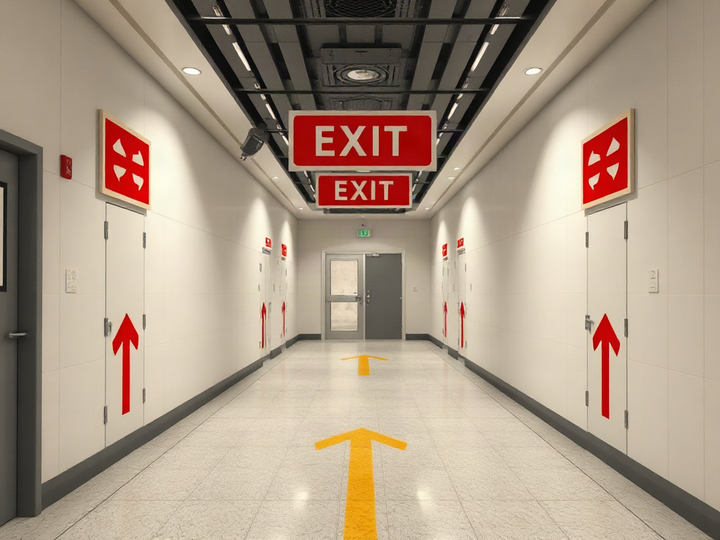
Emergency plan images showing evacuation routes should identify the viewer’s location, mark primary and alternate exits, use directional arrows, and distinguish stairs, assembly areas, alarms, and safety equipment with consistent symbols. Each image must match the building’s current layout and remain readable when printed, posted, or viewed on a phone. Routes should avoid elevators during fire emergencies and account for locked doors, smoke barriers, mobility needs, and areas where visitors may become disoriented. A useful image is verified by walking every marked path, checking visibility from its posted position, and revising it whenever rooms, doors, access controls, or assembly points change.
What an Evacuation Route Image Must Show
A useful evacuation image presents the building as occupants actually experience it, not merely as an architectural drawing. The viewer needs to recognize the immediate area, find the nearest usable exit, identify an alternative path, and understand where to go after leaving. Fine construction details, furniture inventories, and decorative graphics can obscure those decisions. Simplifying the floor plan is valuable, but removing doors, corridor turns, stair enclosures, or other navigational landmarks can make the image misleading.
The location marker deserves special attention. A prominent “You Are Here” symbol should correspond to the exact wall and orientation where the image is posted. If the plan is mounted beside an elevator facing south, the displayed layout should be understandable from that position. A technically accurate north-up plan may still confuse a person who must mentally rotate it during an alarm. Where practical, orient the image so the top represents the direction the viewer faces.
Routes should be drawn as continuous paths from the location marker to an exterior exit. Directional arrows need to remain visible at corridor turns and junctions, where the wrong choice is most likely. Mark exit doors distinctly from ordinary doors, and show stairs when they form part of the route. Elevators may appear as landmarks, but the image should not imply they are approved evacuation routes during a fire unless the building’s procedures specifically provide for that use.
Include only safety features that help someone act or report useful information. Depending on the site, those may include manual fire-alarm stations, fire extinguishers, first-aid equipment, refuge or assistance areas, emergency phones, and outdoor assembly locations. Symbols should be paired with a short legend because colors and icons are not interpreted uniformly by every viewer.
A compact content check is more reliable than adding visual detail without a purpose:
- Orientation: floor or area name, location marker, and recognizable landmarks.
- Movement: primary route, alternate route, exits, stairs, and restricted passages.
- Destination: designated assembly area or the direction leading to it.
- Support: alarms, communication points, assistance areas, and relevant equipment.
The common failure is treating a floor plan as an evacuation plan. A floor plan describes space; an evacuation image supports decisions while time, visibility, and attention may be limited. Review Emergency plan images showing evacuation routes from the perspective of a visitor who does not know room names or staff-only shortcuts.
How to Draw Routes That Remain Clear Under Stress
Visual hierarchy determines whether a route can be understood in seconds. The route lines, location marker, exits, and assembly direction should attract attention before room labels and background geometry. Use a restrained palette with strong contrast between the path and floor plan. Color can reinforce meaning, but shape, labels, and line styles should carry the same information for people with color-vision differences and for copies printed in grayscale.
Primary and alternate routes must look different without creating a puzzle. A solid line can indicate the primary path while a dashed line identifies the alternate, provided the legend states that meaning. Two similarly colored lines crossing several rooms create ambiguity. Keep paths centered through corridors and terminate them clearly at exit doors rather than allowing them to fade into the edge of the image.
Scale and viewing distance also change the design decision. A detailed plan that works on a desktop monitor may become unreadable on letter-size paper. Test the smallest version that will actually be posted. Room names should be large enough to read from a natural standing distance, while arrows should remain recognizable under dimmer corridor lighting. If a large facility cannot fit legibly on one sheet, use a local floor image with enough surrounding context to reach exits instead of shrinking the entire campus into an indecipherable diagram.
Consider a hotel corridor with guest rooms on both sides and stairs at opposite ends. An image posted inside each room may show the room position, the nearest stair, the opposite stair, corridor turns, alarms, and a route beyond the exterior discharge. A lobby image, by contrast, may need a broader view because occupants can approach from several directions. Reusing the room image in the lobby saves design time but may give viewers the wrong orientation.
Plain language should support the graphics. Labels such as “Exit Stair A,” “Outside Assembly Area,” and “Do Not Use Elevator During Fire” are more actionable than unexplained abbreviations. Multilingual sites may need translated instructions, but crowding several translations around every symbol can reduce readability. A practical compromise is a largely symbolic map with a concise multilingual legend and separate written procedures nearby.
Signs that the design is working include quick route identification, correct interpretation without coaching, and consistent answers from people viewing the image from its installed position. Signs of failure include tracing the route with a finger, mistaking a normal door for an exit, overlooking the alternate path, or asking which direction the image faces. Those observations are more informative than approving the design solely because it looks polished.
Primary Routes, Alternate Exits, and Accessibility
An alternate route must be physically independent enough to remain useful when the primary route is unavailable. Drawing a second line that follows the same corridor before splitting near the exit provides little protection if smoke, debris, or a locked door blocks the shared segment. Where the layout permits, alternatives should separate at a meaningful decision point and lead to another suitable exit.
Route selection should reflect actual hazards and operating conditions. A shortest path through a kitchen, workshop, chemical storage area, or frequently locked courtyard may be less dependable than a slightly longer route through a protected corridor. Likewise, a door shown as an exit may require a badge after hours or lead into an enclosed yard. The image cannot correct those physical problems; they need to be resolved through access controls, operating procedures, or a different marked path.
Mobility needs require more than adding a wheelchair symbol. Stairs, narrow doors, steep ramps, heavy hardware, and uneven outdoor surfaces can make a marked route unusable. Images should identify accessible exits, designated assistance or refuge locations where applicable, and the assembly destination reached by that route. The details must align with the site’s emergency procedures rather than suggesting that a symbol alone guarantees independent evacuation.
For example, an employee using a mobility device may normally enter through an accessible ground-floor door that is farther from the work area than the nearest stair. The posted image should distinguish that usable route and show what happens if the ground-floor corridor is blocked. A personal assistance arrangement may also be needed, but it should not exist only on the diagram. Staffing, communication, backup responsibility, and the individual’s preferences all affect whether it can work during an actual event.
Different emergencies may also change the correct action. A route suitable for a fire may lead toward an outdoor hazard, while severe weather or a hazardous release may call for sheltering rather than evacuation. Avoid drawing multiple hazard-specific paths on one image if they become visually tangled. A clear evacuation map can be paired with separate shelter instructions, or separate images can be used where the actions materially differ.
When reviewing Emergency plan images showing evacuation routes, ask what would make each marked path unusable. Check locked or alarmed doors, construction barriers, storage in corridors, seasonal gates, poor lighting, and access to the assembly point. The strongest route is not necessarily the shortest one on paper; it is the path that remains recognizable, passable, and compatible with the people expected to use it.
How to Verify, Place, and Maintain Each Image
Every route should be walked before an image is approved. Begin at the exact posting location, follow the primary path, open each required door, continue to the assembly area, and repeat the process using the alternate route. Conduct the check under normal operating conditions and, where relevant, after-hours conditions. A path that works when reception is staffed may fail when access-controlled doors change state.
Verification should compare the image with the physical environment at each decision point. Confirm that arrows match corridor turns, stair labels match signs, exit doors lead where expected, and the outdoor path does not stop at a fence or loading area. Check whether the assembly point creates conflicts with emergency vehicle access, traffic, overhead hazards, or building discharge. Local fire officials, building safety professionals, or other authorities having jurisdiction may need to review plans depending on the occupancy and applicable requirements.
Placement affects usefulness as much as graphic quality. Install images where occupants naturally pause or make route decisions: near room exits, corridor intersections, elevator lobbies, reception points, shared work areas, and guest accommodations. Mounting an image behind an open door, above eye level, or inside a staff-only cabinet defeats its purpose. Lighting, glare, and protective covers should also be evaluated from the normal viewing position.
A practical review sequence keeps the check focused:
- Stand where the finished image will be viewed and confirm its orientation.
- Trace both marked routes without relying on local knowledge.
- Walk the paths and test every door or gate involved.
- Verify symbols, labels, assistance points, and the assembly destination.
- Ask an unfamiliar user to interpret the image without prompting.
- Record the approval date and the event that will trigger the next review.
Images become outdated when walls move, departments change, doors receive new access controls, construction closes a corridor, or assembly areas are relocated. A scheduled review catches gradual changes, while a change-triggered review addresses modifications immediately. The source file should have a named owner so outdated copies can be replaced consistently across printed signs, digital handbooks, and mobile resources.
Drills provide a final reality check, but a fast evacuation alone does not prove the image worked; regular occupants may simply know the building. Observe visitors, new employees, contractors, and people starting from less familiar areas. Wrong turns, crowding at one exit, ignored alternate routes, or uncertainty outside indicate that the image, posted signs, training, or physical route needs correction. Use the same observations when updating Emergency plan images showing evacuation routes across the facility.
Frequently Asked Questions
Should an evacuation image always be oriented north?
No. A viewer-oriented image is often easier to interpret because its top corresponds to the direction the person faces. If north is operationally relevant, include a north arrow without sacrificing intuitive orientation.
How many evacuation routes should an image show?
Show a primary route and a genuinely usable alternate whenever the layout and approved procedures provide both. Avoid extra lines that add complexity without leading to distinct, available exits.
Can a building floor plan be used as an evacuation image?
It can serve as the base, but it should be simplified and supplemented with a location marker, route arrows, exits, stairs, a legend, relevant safety features, and the assembly destination.
Where should evacuation route images be posted?
Place them at occupied rooms, corridor junctions, reception areas, elevator lobbies, and other decision points. Each image must match its exact installed position and remain visible under expected lighting conditions.
How often should evacuation images be updated?
Review them on a regular schedule and immediately after layout, door-control, route, occupancy, construction, or assembly-area changes. Replace every affected printed and digital copy together.
Conclusion
Effective route images are operational tools, not decorative floor plans. Prioritize accurate orientation, readable paths, distinct exits, a viable alternative, accessible movement, and a clearly identified destination outside the building. Then confirm those elements by walking each route from the image’s installed position and asking an unfamiliar person to interpret it without assistance.
The next step is a physical audit. Carry the current image through the building, test doors and gates, inspect corridor obstructions, and compare every symbol with what occupants will encounter. Assign ownership for revisions and connect updates to renovations, access-control changes, and drill observations. If the drawing conflicts with the building, correct the route or the image before relying on either during an emergency.