Scene safety determines whether a helper becomes a second casualty. Before touching an injured person, pause long enough to identify moving vehicles, live wires, fire, unstable debris, aggressive animals, chemical vapors, floodwater, falling objects, or poor visibility. An injury may be obvious, but the environmental hazard may be the factor that continues causing harm. The safest response may be to keep distance, warn others away, and call trained responders rather than attempt a rescue.
Use a simple outside-in assessment. Look at the ground, overhead area, nearby structures, air movement, and escape route. Do not rely on the absence of a strong odor; some dangerous gases have little warning smell, and a familiar smell can become difficult to notice after exposure. In traffic, stand where approaching drivers can see you and avoid placing yourself between vehicles. Near water, assume submerged debris, current, and unstable banks are present unless responders have confirmed otherwise.
Moving a person is a judgment call, not an automatic first step. If there is immediate fire, collapse, drowning, or active violence, relocation may be necessary. If the scene is stable, unnecessary movement can worsen a spinal, pelvic, or limb injury. A common mistake is rushing toward the casualty while carrying no way to summon help; another is entering a confined or contaminated space because the person appears close enough to reach. Call emergency services, provide the exact location, and describe the hazard before choosing a rescue action.
Practical Injury or environmental emergency response steps begin with a safe position for the helper. Keep bystanders back, use barriers where available, and avoid contact with blood or unknown substances. Gloves can reduce contact risk, but ordinary gloves do not make a chemical, smoke, or confined-space rescue safe. If the hazard cannot be controlled from outside, wait for personnel equipped and trained for that environment.
Sort the Problem: Injury, Exposure, or Both
Classifying the emergency helps determine what must happen first. A person may have a physical injury, an environmental illness, a toxic exposure, or several of these at once. A fall from a ladder can cause bleeding and heat stress; a vehicle crash can combine blunt trauma with fuel, smoke, or electrical hazards. Treat the immediate threat to life while gathering information that will guide professional care.
Check responsiveness and normal breathing, then look for severe bleeding. If the person is unresponsive and not breathing normally, emergency dispatch instructions and immediate resuscitation measures take priority. If there is major bleeding, apply firm direct pressure with a dressing or clean cloth when the scene allows. Do not waste time searching for a perfect medical kit. If a dressing becomes soaked, add material over it rather than repeatedly removing the original layer. A tourniquet should be used only when appropriate and according to current training or dispatcher guidance.
Environmental symptoms may be less dramatic than a wound but can deteriorate quickly. Confusion, unusual behavior, collapse, severe weakness, breathing difficulty, chest discomfort, uncontrolled shivering, hot dry skin, or inability to stay awake warrant urgent medical help. Ask what happened, when exposure began, whether the person was wearing protective equipment, and whether others nearby have similar symptoms. Those details can reveal a shared environmental cause rather than an isolated medical event.
Do not force food, drink, medication, or vomiting when the person is confused, unconscious, having trouble swallowing, or exposed to a suspected poison. Do not apply neutralizing chemicals to a skin exposure unless qualified guidance specifically directs it. For contamination, remove the person from the source when safe, avoid spreading the substance, and follow product-label or poison-control instructions. The weak assumption that every emergency is “just an injury” can delay decontamination and expose helpers.
Use Injury or environmental emergency response steps as a sequence of decisions: Is the scene safe? Is the person responsive and breathing normally? Is there life-threatening bleeding? Is there an ongoing exposure? What information will responders need? That sequence is more reliable than trying to identify a diagnosis at the scene.
Prioritize Immediate Care and Emergency Communication
Emergency communication should happen early when serious injury or dangerous exposure is possible. Tell the dispatcher the exact location first, then explain what happened, how many people are affected, the active hazard, and the person’s most serious signs. A rural driveway, trail junction, industrial area, or large building may require a landmark, access gate, floor, room, or GPS coordinates. Send a bystander to guide responders only when doing so does not leave the injured person alone.
While waiting, follow dispatcher instructions and continue observing the person. Keep an alert person in a position that supports comfortable breathing, but avoid moving someone with a possible serious injury unless the location itself is unsafe. Control visible bleeding, protect the person from rain or cold, and avoid crowding. A conscious person may provide useful information about allergies, medications, medical conditions, and the exposure substance, but do not delay urgent care for a complete history.
Priorities can change. A person who initially answers questions may become drowsy after smoke exposure, head trauma, heat illness, or blood loss. Recheck responsiveness and breathing when the situation changes. If breathing becomes abnormal or stops, begin the response directed by emergency dispatch. If vomiting occurs while the person is unconscious, follow dispatcher guidance about positioning and airway protection; do not blindly reach into the mouth.
One frequent failure is focusing on a visible wound while overlooking breathing difficulty or altered mental status. Another is giving responders a long narrative without the facts they need to act: current location, hazard, number of patients, consciousness, breathing, severe bleeding, and changes over time. The best handoff is concise and updated. Explain what was done, when it was done, and whether the person improved, worsened, or remained unchanged.
A compact priority list is useful under stress:
Protect yourself and others from the active hazard.
Call emergency services for life threats or unsafe conditions.
Check responsiveness, normal breathing, and severe bleeding.
Stop ongoing exposure only when the action is safe.
Monitor changes and transfer clear information to responders.
Manage Heat, Cold, Water, Smoke, and Contamination
Environmental emergencies require both removal from the hazard and appropriate supportive care. Heat illness may follow exertion, high temperature, humidity, or inadequate fluid intake; cold injury may develop from wet clothing, wind, immersion, or prolonged inactivity. Smoke and combustion products can impair breathing even when skin burns are minor. Water incidents add drowning risk, hidden trauma, and hypothermia. The first action differs by hazard, so a single “cool everyone” or “warm everyone” rule is unsafe.
For heat-related illness, move the person to shade or a cooler location and remove excess outer clothing when safe. If the person is confused, collapsing, vomiting repeatedly, or unable to drink normally, treat the situation as urgent rather than relying on oral fluids. For cold exposure, move to shelter, replace wet layers with dry insulation when practical, and handle a person with suspected cold injury gently. Do not rub numb or frozen skin, and do not use intense direct heat that can burn damaged tissue.
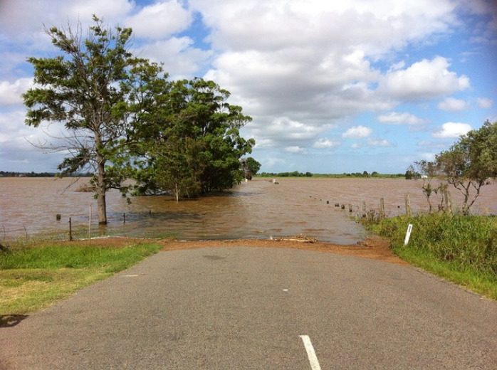
After smoke exposure, fresh air is useful only if reaching it does not require passing through smoke or fire. Breathing difficulty, hoarseness, facial burns, persistent coughing, confusion, or worsening symptoms require emergency evaluation. In a water incident, do not create a second drowning by swimming into current or approaching unstable ice. Use a reach, throw, or other safer method from shore when possible, and wait for trained water rescuers if the person cannot be reached without entering the hazard.
Chemical exposure calls for source control and careful contamination management. Remove contaminated clothing when safe, keep the substance away from unaffected skin, and use copious water for many skin or eye exposures unless product instructions or professional guidance say otherwise. Avoid improvised neutralizers, ointments, and household cleaners. Bring the product container or its label information for responders without carrying a leaking container into a vehicle or occupied building.
Environmental care has tradeoffs: rapid removal may be lifesaving, while rough handling can worsen injury; cooling or warming may help, while extreme temperature applied too quickly can cause harm. The practical test is whether the person’s breathing, alertness, pain, skin condition, or ability to communicate is improving. If symptoms progress, treat that change as evidence that professional care is needed, not as a reason to try increasingly aggressive home measures.
Monitor, Transfer Care, and Improve Readiness
Observation continues after the immediate danger appears controlled. Shock, airway swelling, internal injury, heat illness, and toxic effects may become clearer over time. Keep the person with a responsible adult when possible, maintain a safe temperature, and watch for changes in breathing, alertness, skin color, pain, coordination, and ability to answer simple questions. A temporary improvement does not prove that a serious injury or exposure has resolved.
Prepare a concise handoff before responders arrive. Record the approximate time of the incident, the person’s initial condition, relevant exposure duration, first-aid actions, medications or substances involved, and any changes. Avoid moving evidence or contaminated materials unnecessarily, but take a photograph of a product label from a safe distance if that will help identify the substance. Do not make promises about recovery or encourage a person to drive themselves after fainting, confusion, significant injury, or hazardous exposure.
Households and workplaces should rehearse the decisions that are hardest to make under pressure: who calls, who meets responders, where the first-aid supplies are, how access is provided, and which hazards require evacuation rather than intervention. A kit should match the setting, but equipment cannot replace training. A flashlight, gloves, dressings, clean water, communication device, and written location details may be useful, while specialized rescue gear should be used only by people trained to use it.
After the event, review what failed without turning the review into blame. Was the location difficult to describe? Did anyone enter an unsafe area? Were gloves or clean water inaccessible? Did the group mistake a serious symptom for fatigue? These questions reveal practical improvements. More supplies may not solve a communication problem, and a longer checklist may not help if it cannot be read in darkness or stress. The most useful readiness measure is a short, practiced response that protects the helper, activates professional support, and preserves accurate information.
For broader household preparation, connect these decisions with Injury or environmental emergency response steps and keep local emergency numbers, poison-control guidance, workplace procedures, and evacuation routes available in more than one format.
Frequently Asked Questions
What should happen first at an injury scene?
Check whether the area is safe for you and the injured person. Identify active hazards, call emergency services when needed, and then assess responsiveness, breathing, and severe bleeding.
When should an injured person be moved?
Move the person only when remaining in place creates a greater immediate danger, such as fire, collapse, drowning, or active violence. Otherwise, unnecessary movement may worsen serious injuries.
How should a suspected chemical exposure be handled?
Stop contact with the source when safe, remove contaminated clothing if appropriate, rinse according to product guidance, and contact emergency services or poison-control professionals for specific instructions.
What environmental symptoms require urgent help?
Confusion, collapse, abnormal breathing, severe weakness, uncontrolled shivering, worsening heat symptoms, smoke-related breathing problems, or inability to stay awake require urgent medical attention.
What information should be given to responders?
Give the exact location, number of people affected, hazard type, time of incident or exposure, major symptoms, changes observed, and first-aid actions already taken.
Further Reading
Authoritative Sources
First Aid and Medical Emergencies ready.gov
Provides preparedness information for first-aid supplies, medical emergencies, and emergency planning
Heat Stress cdc.gov
Explains workplace heat hazards, warning signs, and protective actions
Poison Control poison.org
Offers guidance for suspected poison exposures and contact information for poison specialists in the United States
Conclusion
Effective response to injury or environmental danger depends on sequence and judgment. Protect the helper first, identify the active hazard, summon professional help early for serious signs, and provide only care that is safe for the situation. Check breathing, responsiveness, and major bleeding before focusing on less urgent details. Heat, cold, smoke, water, and chemical exposures require hazard-specific actions; improvised treatment can create additional harm. Continue monitoring because a person who appears stable may deteriorate after trauma or exposure. Prepare by practicing location details, communication roles, evacuation choices, and basic first aid before an incident occurs. When uncertainty remains, keep distance from the hazard and follow emergency-dispatch instructions rather than taking an untrained rescue risk.
A personal evacuation plan converts general awareness into specific decisions that can be made under pressure. During a fast-moving hazard, people may have incomplete information, blocked roads, limited phone service, or only minutes to collect what they need. A written plan gives household members a shared starting point instead of forcing them to negotiate every choice during the disruption.
The purpose is not to predict the exact disaster. It is to establish actions that remain useful across several hazards: leave when authorities direct evacuation, leave when conditions make the residence unsafe, choose a viable route, reach an agreed destination, and report status. The same structure may apply to a wildfire warning, a major storm, a gas leak, or a neighborhood power failure that affects medical equipment.
Planning also exposes constraints that are easy to miss. A route that works for a healthy adult may not work for someone using a wheelchair. A destination that accepts one household member may not accept a pet. A vehicle plan may fail if the driver is away, fuel stations are closed, or a child needs a specialized car seat. Writing these issues down makes them solvable before an emergency.
A weak assumption is that official warnings will provide every personal instruction. Public alerts may identify the hazard and evacuation area, but they cannot know which family member is home, which exit is accessible, or where medication is stored. Use official instructions as the controlling safety information, then use the personal plan to organize the household response. The related Purpose of a personal emergency evacuation plan is therefore practical: it closes the gap between public direction and individual action.
What a Workable Plan Must Contain
A workable plan names people, places, actions, and limits. It should identify household members, emergency contacts outside the immediate area, primary and alternate exits, transportation options, destinations, and a method for confirming that everyone is safe. Keep the wording simple enough for a teenager, visitor, or temporary caregiver to follow.
Start with the first decision point: what will cause the household to leave? Some events require following an evacuation order, while others require immediate movement away from an unsafe room or building. The plan should not encourage waiting for perfect certainty. It can state who checks official alerts, who assists a dependent person, and who collects the preselected essentials if time permits. No item should delay departure when conditions are deteriorating.
Account for different needs rather than creating a fictional average household. Include prescriptions, mobility devices, hearing or visual communication needs, infant supplies, pet carriers, service animals, important documents, and a way to maintain essential medical equipment. A person who relies on electricity should know the backup location and transportation arrangement before an outage or evacuation order occurs.
A compact household checklist may include:
Two ways out of the home or building, with accessibility limitations noted.
At least two destinations, such as a nearby safe location and an out-of-area contact or lodging option.
One contact method that does not depend on every person calling at once.
Transportation details, including who can drive, where keys are kept, and what happens if a vehicle is unavailable.
A short departure kit stored where it can be reached without searching.
Do not confuse a long inventory with a strong plan. A three-page list of possessions can distract from the route, destination, and people who need assistance first. The practical test is whether a household member can locate the plan, understand the first move, and leave without improvising critical details.
Routes, Destinations, and Communication Choices
Route planning should account for changing conditions rather than treating one familiar road as permanent. Identify a primary route and at least one alternative, then note bridges, low-lying areas, narrow roads, tunnels, or intersections that could become unusable. A map saved on a phone is useful, but printed directions or a marked paper map provide a backup when batteries, cellular service, or internet access fail.
Choose destinations based on safety and suitability, not merely distance. A nearby location may be inaccessible because it lies in the same hazard area. A farther destination may be more practical if it offers shelter, accessible facilities, medication access, or a trusted contact. Ask whether the destination can accommodate pets, children, equipment, and the expected length of disruption. The best destination on an ordinary day may not be the best option during a regional evacuation.
Communication plans work better when they reduce congestion. Designate an out-of-area contact who can receive brief status messages, and agree on what a message means, such as “left home,” “at destination,” or “need assistance.” Text messaging may work when voice calls do not, but no single method should be treated as guaranteed. Household members should know when to stop trying to call and move to the agreed meeting point or contact sequence.
Consider a split-household scenario. One adult may be at work, another may be collecting a child, and a pet may be at home. A plan that says “meet at home” can fail if the home is inside the evacuation zone. A stronger arrangement names an initial meeting place outside the immediate hazard area and a second location farther away. It also states who is responsible for each dependent person without assuming that the usual caregiver will be available.
Review route information against official evacuation zones and local emergency-management instructions. The personal plan supplements those instructions; it never overrides a closure, shelter direction, or order to use a designated route. The personal evacuation plan should make official guidance easier to follow, not create a competing command system.
Testing, Updating, and Avoiding Failure
A plan becomes reliable through small, realistic tests. Walk the exits, drive the alternate route, locate the departure kit in low light, and verify that every household member knows the meeting points. A drill does not need to imitate a catastrophe. Its purpose is to reveal friction: a locked gate, an inaccessible stairway, a dead phone, an expired prescription, or uncertainty about who collects a child.
Test the parts most likely to fail under time pressure. Ask a household member who did not write the plan to explain the first three actions. Check whether printed directions are legible, whether vehicle fuel or charging arrangements are adequate for the intended route, and whether carriers or mobility equipment can be moved quickly. If the answer depends on one person, one key, or one vehicle, add a backup.
Plans also expire when circumstances change. Update them after a move, new job schedule, school change, new pet, medical change, vehicle replacement, road construction, or change in emergency contact. Confirm that phone numbers, addresses, access codes, and medication information remain accurate. Keep a paper copy in a known location and a digital copy where household members can reach it, while protecting sensitive personal information.
Common failure modes include packing too much, choosing a destination without confirming access, assuming everyone will receive the same alert, and delaying departure to retrieve nonessential property. Another mistake is practicing only the preferred route. Compare the plan with an alternative approach: sheltering may be safer for some hazards when authorities advise it, while evacuation is necessary for others. The decision should follow current official instructions and the conditions at the location, not a rigid rule written months earlier.
Use a brief review after each drill or real incident. Record what took too long, what information was missing, and which responsibility was unclear. Then change the plan itself rather than relying on memory. The plan’s purpose is fulfilled when it produces faster, clearer action under the household’s actual constraints.
For local evacuation zones, alert systems, shelter information, and hazard-specific instructions, consult your city or county emergency-management office, state emergency agency, and official national emergency guidance. Local authorities provide the route closures and protective-action information that a household plan must reflect.
Frequently Asked Questions
What is the main purpose of a personal emergency evacuation plan?
It turns a stressful departure into agreed actions for leaving, traveling, contacting others, and reaching a suitable destination.
How many evacuation routes should a household identify?
Identify a primary route and at least one realistic alternative, then check both for accessibility, closures, and hazard exposure.
Should the plan include a meeting place?
Yes. Choose one meeting point outside the immediate hazard area and another farther away in case the first becomes inaccessible.
What should happen if family members are separated?
Use an agreed out-of-area contact, short status messages, and defined destinations rather than relying on repeated phone calls.
How often should an evacuation plan be reviewed?
Review it after household, transportation, health, contact, or route changes and test it periodically so unclear responsibilities are found early.
Conclusion
A personal evacuation plan is most useful when it answers practical questions before conditions become confusing: who leaves, when they leave, where they go, how they travel, and how separated people reconnect. Prioritize accessible exits, alternate routes, suitable destinations, dependent-person needs, communication backups, and official alert information. Keep the departure kit limited to items that support immediate safety, and never let property collection delay movement from a dangerous area. Walk through the plan with the people who may need to use it, then revise it after every meaningful household or route change. A short, current plan that people can follow is more valuable than a detailed document no one has tested.
An emergency triangle placement diagram is a visual map of the stopped vehicle, the direction of approaching traffic, and the warning devices placed behind or around the hazard. Its purpose is not to provide a universal measurement that works on every road. It shows the relationship between the vehicle and the sightline: drivers need to see the warning before they reach the disabled car, and the person setting it out needs a route that avoids unnecessary exposure to moving traffic.
Most diagrams show a vehicle on the shoulder with a warning triangle behind it, often supplemented by additional triangles when the road layout or local rules call for them. The triangle should face approaching traffic and stand upright on a stable surface. A device turned sideways, hidden by grass, or placed in the vehicle’s shadow may technically be present but function poorly because its reflective surface is not aimed at the people who need the warning.
The diagram is best read as a decision aid rather than a promise of safety. A straight, level road gives drivers more sight distance than a sharp bend, crest, narrow bridge, or rain-darkened roadway. A shoulder wide enough for a person to walk beside the guardrail offers a different risk profile from a highway where the vehicle is partly in a live lane. Those differences should determine whether placing a triangle is sensible at all.
Use the Emergency triangle placement diagram explained here as a planning reference, then verify local requirements before relying on a particular arrangement. Vehicle manuals, roadside assistance instructions, and the triangle’s packaging may specify a pattern that differs from a generic illustration.
Where to Place Warning Triangles
Warning triangles normally belong on the traffic-facing approach to the stopped vehicle, far enough away to give approaching drivers time to identify the obstruction and move over or slow down. The correct location depends on the road, not simply on the length of the shoulder. A device positioned immediately beside the bumper may be easy for the person placing it to reach, but it gives a following driver almost no additional reaction time.
On a two-way road, think about both directions of travel. If the vehicle creates a hazard for traffic approaching from either side, a warning arrangement may need to address both approaches, provided doing so does not expose anyone to unnecessary danger. On a divided roadway, the opposite carriageway is usually separated from the stopped vehicle’s traffic flow, so crossing or walking toward it is not a reasonable part of the placement process.
Distance should increase when the view is restricted. A triangle placed before a bend or hill crest is more useful than one placed after the obstruction, because drivers must see the warning before they reach the point where the disabled vehicle becomes visible. Yet moving it farther away can create a new risk if the route passes through traffic, debris, a drainage ditch, or an unstable shoulder. Visibility and personal access must be evaluated together.
Picture a car stopped just beyond a bend at dusk. A triangle placed close behind the car may be visible only for a moment, while a device set before the bend can warn drivers earlier. If reaching that position requires walking in the lane, staying inside the vehicle with hazard lights on and contacting roadside assistance may be safer than deploying the triangle. The best placement is the one that improves warning without creating a second casualty risk.
How Road Conditions Change Placement
Road speed, traffic volume, visibility, and surface conditions all affect how useful a warning triangle will be. Higher speeds leave less time for a driver to recognize a small object and respond, while rain, fog, snow, glare, and darkness can reduce the distance at which reflective material becomes noticeable. A diagram that looks adequate in daylight on a straight road should not be treated as a fixed answer during a storm or at night.
Curves and hills deserve special attention because they interrupt the driver’s sightline. The first triangle should be placed where it can be seen before the obstruction, not merely at a standard distance behind the vehicle. A second or third device may help define the hazard on a long approach, but more devices do not compensate for a placement route that requires standing in traffic. Follow the product instructions and applicable road rules when they specify the number or arrangement.
Surface stability also matters. A lightweight triangle can tip on loose gravel, wet grass, a sloped shoulder, or a strong crosswind. A fallen device may disappear from a driver’s view or become a projectile. Place it on the firmest practical surface, keep its face oriented toward traffic, and avoid positioning it where passing vehicles can strike it immediately. Do not improvise by standing in the lane to retrieve a device that has fallen.
Consider the difference between a quiet rural road and a multilane expressway. On the rural road, a person may have a clearer route along a broad shoulder, but drivers may approach quickly around bends. On the expressway, traffic volume and speed make roadside exposure more severe, even when the shoulder appears generous. In the second situation, hazard lights, occupants remaining behind a barrier when possible, and professional assistance may deserve priority over a perfect triangle pattern.
Common Placement Mistakes and Safer Choices
The most common error is treating the diagram as a measurement chart instead of a visibility-and-risk illustration. People may place every triangle at an identical distance without checking whether a bend, hill, parked truck, vegetation, or road furniture blocks it. Another error is assuming hazard lights make walking beside live traffic safe. They alert other road users, but they do not stop vehicles from drifting onto the shoulder.
Placement also fails when the warning device is hidden behind the vehicle, aimed away from approaching drivers, or set so close to the edge line that it blends into the pavement. A triangle should be visible from the approach that matters and should not be confused with an object that drivers can ignore. Reflective devices are generally more useful at night when illuminated by headlights, but they are not a substitute for adequate distance or a clear sightline.
Use a short priority check before opening the door:
Can the vehicle be moved completely out of the travel lane without worsening the problem?
Can occupants exit on the side away from traffic and reach a safer location?
Is there a clear shoulder route for placing the device without crossing live lanes?
Are weather, darkness, road speed, and visibility making roadside exposure unreasonable?
Would calling roadside assistance or emergency services provide a safer response?
A frequent misconception is that more warning devices always mean more safety. Additional triangles can improve recognition on a long or winding approach, but each one requires someone to place and possibly retrieve it. If the first device already requires dangerous exposure, adding more may increase risk rather than reduce it. Use the roadside triangle reference to identify the traffic approach, then choose the least hazardous practical action.
A Practical Roadside Placement Sequence
A safe sequence begins before anyone walks away from the vehicle. Turn on hazard lights if the vehicle’s condition and local practice make that appropriate, set the parking brake, and assess whether the car is stable. Look for traffic movement, road edges, barriers, slopes, and a route to a protected position. If the vehicle is in a dangerous location, occupants should prioritize getting away from moving traffic when that can be done safely and should contact the relevant emergency or roadside service.
If placing a triangle is reasonable, carry it in a way that keeps your attention on traffic and your footing. Walk on the safest available side of the road, keep clear of the live lane, and place the device facing approaching drivers. Check it from the perspective of an oncoming driver if you can do so without re-entering danger: it should be upright, visible, and not concealed by the vehicle or roadside objects.
Return by the same protected route rather than taking a shorter path through traffic. If a triangle is lost, struck, or blown over, do not automatically go back for it. The warning device is replaceable; a person exposed to a fast-moving roadway may not have a safe opportunity to recover from a mistake.
A useful final check is simple: can a driver see the warning before reaching the stopped vehicle, and can the person placing it reach the location without becoming part of the hazard? If either answer is no, change the plan. Move the vehicle only if doing so is safe, remain in a protected position, and give responders precise information about the road, direction of travel, nearest landmark, and vehicle location. For broader preparation, the Emergency triangle placement diagram explained resource can be stored with the vehicle’s roadside kit.
For route-specific requirements, consult the vehicle owner’s manual, the warning triangle manufacturer’s instructions, and the official transportation or highway-safety authority for the jurisdiction where the breakdown occurs. Those sources are more reliable than a generic diagram when rules differ for two-way roads, divided highways, commercial vehicles, or restricted-access routes.
Frequently Asked Questions
How far behind a stopped vehicle should an emergency triangle be placed?
There is no single distance for every road. Place it far enough ahead of the hazard to provide a clear warning, adjusting for speed, curves, hills, darkness, and local rules while avoiding exposure to live traffic.
Should triangles be placed in front of the vehicle?
That depends on the road layout and which traffic movements are exposed. On a two-way road, both approaches may matter, but no front placement justifies crossing a dangerous lane or median.
Do hazard lights replace warning triangles?
No. Hazard lights make the vehicle more noticeable, while triangles can provide advance warning beyond the vehicle’s immediate location. Neither removes the need to avoid unsafe roadside exposure.
What should I do if the shoulder is too narrow?
Remain in the safest available position, keep occupants away from traffic when possible, and contact roadside assistance or emergency services. Do not walk in a live lane simply to achieve the diagram’s ideal arrangement.
Are reflective triangles effective at night?
They may reflect headlight beams and improve recognition, but effectiveness depends on orientation, visibility, distance, and weather. Keep them upright and unobstructed, and use other vehicle warning measures when appropriate.
Conclusion
An emergency triangle diagram is most useful when it teaches sightline management rather than a rigid number of steps or meters. Place the device where approaching drivers can see it before reaching the stopped vehicle, orient it toward traffic, and account for bends, hills, speed, darkness, weather, and surface stability. The person placing it remains the highest priority: a warning triangle is not worth entering a live lane, crossing a median, or walking through an unsafe shoulder. Review your vehicle’s equipment instructions before an incident, keep the triangle accessible, and learn the local roadside rules. During a breakdown, reassess the scene before opening the door and choose the arrangement that improves visibility without creating a second emergency.
A strong emergency action plan presentation is a decision aid, not a condensed policy manual. The slide order should answer the questions people face during an incident: What is happening? What should I do now? Who is responsible? Where do I go? How will leaders know that people are safe? A logical sequence reduces the need to search across unrelated slides.
For most workplaces, schools, community facilities, or households, the opening slides should establish the scope and the immediate actions. Identify the location or audience, the hazards covered, the plan owner, the revision date, and the emergency contact method. Follow that with trigger conditions, such as a fire alarm, severe weather warning, hazardous-material release, power failure, or credible security threat. The trigger slide should not imply that every event receives the same response; sheltering during a tornado warning differs from evacuating for smoke.
A practical middle section can follow this order:
Situation: hazards, warning signs, and the authority or system that activates the plan.
Immediate protection: evacuation, shelter-in-place, lockdown, medical response, or another site-specific action.
Roles: incident lead, floor or area coordinators, first-aid contacts, communications staff, and alternates.
Accountability: assembly points, check-in method, visitor records, and reporting of missing or injured people.
Follow-through: all-clear authority, documentation, re-entry limits, and post-incident review.
The ordering matters because a slide about recovery placed before immediate protective action can distract from urgent behavior. Conversely, a deck that shows only evacuation routes may fail when evacuation is unsafe or when occupants need to shelter. Compare a one-route presentation with a decision-based presentation: the first is simpler to create, while the second is more useful when conditions change. The tradeoff is additional planning work, but the result better reflects real incidents.
Use the Emergency action plan PowerPoint structure as a working document during review, not as a fixed template. Ask someone unfamiliar with the site to locate the correct action, contact, and assembly area. If that person cannot do so quickly, the slide sequence or labels need revision.
Assign Roles, Triggers, and Communication Paths
Role clarity is the operational center of the deck. An emergency action plan should show what each person is expected to do, what authority they have, and what happens if they are absent. Listing job titles without duties creates the appearance of organization but leaves decisions unresolved.
Give each role a concise action statement. For example, an area coordinator may sweep assigned rooms only when doing so is safe, direct occupants toward the designated exit, bring a roster if available, and report status at the assembly point. A communications lead may send approved notifications, monitor official updates, and correct conflicting information. An incident lead may authorize escalation or communicate when re-entry is permitted. These statements are more useful than a slide containing only names, phone numbers, and a hierarchy chart.
Triggers should be observable and tied to a response. “Bad weather” is too broad for a slide; “official warning received” or “conditions make the normal exit unsafe” gives users a clearer decision point. Avoid presenting uncertain information as a confirmed fact. A deck can state who verifies an alert, which sources are recognized by the organization, and which backup method is used when the primary system fails.
Communication design deserves its own attention. Show the primary channel, backup channel, message owner, and information that must be reported. A useful status message might identify the location, the action completed, the number of people accounted for, and unresolved needs. Do not encourage unverified updates or expose sensitive personal information on a public slide.
The common failure is assigning one person to every critical task. That arrangement may work during a practice but collapse during illness, travel, injury, or a simultaneous family or operational emergency. Use primary and alternate assignments, then test whether the alternate has the access, training, and contact information needed to act. For a deeper planning reference, connect this section to the Emergency action plan PowerPoint structure without turning the internal link into a substitute for site-specific decisions.
Turn Procedures Into Usable Visual Instructions
Visual design should make the next action easier to find without replacing the written instruction. A slide may combine a short action heading, a simple map or icon, a responsible role, and a constraint such as “do not use elevators” or “avoid the contaminated area.” The graphic earns its place when it clarifies location, direction, sequence, or priority.
Maps require particular care. Mark exits, fire extinguishers, first-aid supplies, shelter areas, assembly points, accessible routes, and hazards that affect movement. Use a legend and consistent symbols. A decorative floor plan with tiny labels is less useful than a simplified map that removes irrelevant rooms and enlarges the features people must recognize. If routes differ by floor, building, or mobility need, provide separate slides rather than forcing one crowded diagram to serve everyone.
Text should be readable from the intended presentation distance and usable when printed or viewed on a phone. Use plain language, high contrast, descriptive labels, and more than color alone to distinguish actions. A red shape might indicate danger, but it should also say “Do not enter” or “Hazard area.” Captions, meaningful alternative text in the source file, and accessible document order support people who cannot rely on projected visuals or audio.
Consider the difference between an instructional slide and a reference slide. During a briefing, a three-step action slide may work best; after the briefing, a contact directory or detailed map may be useful as an appendix. Combining both purposes often produces unreadable pages. Keep the main sequence short and put supporting material after the operational slides.
A realistic example is a community center that uses one slide for evacuation and another for severe-weather sheltering. The evacuation slide highlights two exits and the outdoor assembly point. The shelter slide identifies interior rooms away from windows and explains who checks attendance. Presenting both responses side by side without a trigger would invite confusion. The better design links each action to the condition that activates it.
Test, Revise, and Maintain the Deck
A presentation is ready for use only when people can apply it under realistic constraints. Review the deck with the people who will act, including reception staff, supervisors, visitors’ hosts, people with access needs, and anyone responsible for shutting down equipment or caring for dependents. Their questions often reveal assumptions that the author no longer notices.
Use a staged test rather than beginning with a full-scale exercise. First, conduct a walk-through: confirm that doors, routes, assembly points, communication devices, and emergency supplies match the slides. Next, run a discussion-based scenario in which participants explain what they would do after a specific trigger. In summary, if appropriate and safely authorized, conduct a drill that measures observable actions such as time to receive the message, route selection, accountability reporting, and escalation of an unresolved problem.
Do not judge success solely by speed. A fast evacuation through an unsafe route is not a successful outcome, and a perfectly completed attendance check is not enough if people never received the initial instruction. Review whether the message was understood, whether alternatives were available, and whether the plan created conflicting tasks. Record changes while the scenario is fresh.
Maintenance should be built into ownership. Recheck the deck after renovations, staffing changes, new equipment, changes to contact systems, or incidents that expose a weakness. Put the revision date and owner on the opening or closing slide, and archive older versions so outdated maps do not remain in circulation. A printed copy may be necessary when power or network access is uncertain, while a digital version is easier to update; using both creates a maintenance obligation but reduces dependence on one format.
Before publishing, verify this compact review list:
Every major hazard has a visible trigger and an associated action.
Roles include alternates and safe limits on what people should do.
Maps, contacts, routes, and assembly points match current conditions.
Instructions work for visitors and people who need accessible alternatives.
Communication has a backup path and a defined reporting format.
A drill, walk-through, or scenario review has produced documented revisions.
Use the Emergency action plan PowerPoint structure again after testing, because the most valuable revisions usually come from observed confusion rather than from slide aesthetics.
For additional planning detail, compare the presentation with official workplace emergency planning guidance from government occupational-safety agencies, local emergency-management offices, and recognized fire-safety organizations. Use those sources to verify terminology and planning responsibilities, then adapt the material to the actual building, audience, hazards, and local procedures rather than copying a generic slide deck.
Frequently Asked Questions
How many slides should an emergency action plan presentation contain?
Use the fewest slides that cover triggers, immediate actions, roles, communication, accountability, and recovery. A short core deck with a clearly separated appendix is usually easier to use than a long policy presentation.
What should the first operational slide show?
Show the hazards covered, the warning or activation trigger, and the immediate protective action. Make the location and intended audience explicit so users do not apply the wrong procedure.
Should maps be included in the PowerPoint?
Yes, when they clarify exits, shelter areas, assembly points, accessible routes, or hazards. Simplify maps and use separate views when one diagram would make labels too small or routes ambiguous.
How can the deck address people with access needs?
Show accessible routes, assistance roles, communication alternatives, and procedures for visitors or occupants who may not hear alarms or read projected text. Confirm those arrangements with the people who will use them.
When should an emergency action plan PowerPoint be updated?
Review it after building, staffing, contact-system, or equipment changes and after drills or incidents reveal confusion. Display an owner and revision date, and remove obsolete copies from shared locations.
Conclusion
A useful emergency action plan presentation gives people a clear path from recognition to action, accountability, and authorized recovery. Put triggers before procedures, assign primary and alternate roles, and separate evacuation, shelter, medical, and communication decisions instead of blending them into one crowded slide. Maps and icons should clarify movement, while plain language and accessible alternatives keep the instructions usable for more occupants. Test the deck with a walk-through or scenario, measure confusion as well as speed, and revise details such as routes, contacts, and assembly points whenever conditions change. The next practical step is to show the draft to someone unfamiliar with the site and ask that person to identify the correct action and reporting point without coaching.
What Effective Emergency Action Plan Clipart Must Show
Useful clipart translates an emergency procedure into a visible action rather than merely adding atmosphere to a page. A running figure, warning triangle, telephone, assembly group, or first-aid symbol can help trainees identify the next step quickly, but only when the image matches the written instruction beside it. The strongest visuals answer three practical questions: who acts, what action occurs, and where the action leads.
For example, an icon of a phone is incomplete if a poster says only “Report the incident.” A better pairing might show a person using a phone beside the words “Notify the designated contact and state your location.” The illustration does not replace the procedure; it reduces the reading burden and reinforces the sequence. A simple exit-door symbol may be more useful than a dramatic fire image because it directs attention toward movement rather than danger.
Choose clipart according to the learner’s task. A classroom worksheet may benefit from several small icons that students match to actions. A workplace briefing sheet may need larger symbols for reporting, evacuation, sheltering, accountability, and re-entry authorization. A digital slide can use animation or progressive reveals, while a printed handout must communicate without motion. Reusing one visual format everywhere is convenient, but it may weaken comprehension when viewing distance, print size, or learner age changes.
Before placing any image, write the action in plain language. Then ask whether the clipart depicts that action or merely the surrounding event. A siren image signals danger, but it does not tell a person to leave, shelter, call, or wait for instructions. The common failure is selecting visually attractive artwork first and forcing the procedure around it. Reverse that order: define the behavior, select a symbol, and add a short label that removes ambiguity.
Choosing Symbols for Different Training Materials
The medium determines how much detail an illustration can carry. Emergency action plan clipart for training materials should be scaled and simplified for its final use, not chosen only because it looks clear on a computer screen. A wall poster viewed from several steps away needs bold shapes, limited text, and strong contrast. A facilitator’s workbook can support more detailed diagrams because the instructor can explain the image. A pocket card needs only the decisions a person may need under pressure.
For a basic evacuation lesson, a practical visual set might include an alert symbol, an exit arrow, a “do not use” symbol over an elevator, a meeting-point marker, and an accountability group. A sheltering lesson may require a building icon, an interior location marker, a phone or radio, and a symbol indicating that occupants should await official direction. These sets should not be mixed casually. An arrow that means “move outside” in one lesson may confuse learners if it appears beside a shelter-in-place instruction.
Color can provide a useful secondary cue, but it should never carry the entire meaning. Red may draw attention to alarms or prohibited actions, while green may suggest an exit or safe route, yet color perception, photocopying, low-quality projectors, and visual impairments can remove those distinctions. Pair color with shape, position, labels, or directional arrows. A crossed-out elevator icon remains interpretable when printed in black and white; a color-only distinction may not.
Rights and editing restrictions also affect selection. Use artwork with clear permission for reproduction, especially when materials will be distributed outside a single session. Keep source files organized so an outdated contact symbol or route diagram can be replaced without rebuilding the entire lesson. The convenient option is often a large collection of unrelated icons, but a consistent line weight and visual style usually makes a compact set easier to scan. The priority is not the number of images; it is whether each image performs a defined instructional job.
Readers developing a visual library can compare examples of Emergency action plan clipart for training materials by action type, viewing distance, and reproduction format. That comparison is more useful than choosing the most detailed illustration.
Designing a Clear Visual Sequence
A strong training sheet presents actions in the order they are likely to occur. Numbered panels, directional arrows, or a vertical path can show progression from recognizing an alert to taking protective action and reporting status. The sequence should reflect the actual plan rather than an artist’s preferred layout. If notification occurs before movement, the visual order should not suggest that everyone immediately leaves.
Consider a workplace scenario in which a staff member notices smoke. A useful sequence could show: recognize the condition, activate the appropriate alarm or notification process, move by the designated route if directed, avoid unsafe equipment, report to the assembly location, and wait for accountability instructions. The exact procedure depends on the organization and hazard, so clipart should support the approved plan rather than invent universal actions. A firefighter, emergency vehicle, or flames may add context, but none should obscure the specific decisions trainees must make.
Keep each panel focused on one decision. Combining an alarm, evacuation route, phone call, and assembly point in one crowded scene may look efficient, yet it forces learners to decode several meanings at once. Separate panels are usually easier to revise and easier for an instructor to discuss. A small caption can clarify timing: “after receiving the alert,” “if directed to evacuate,” or “once at the meeting point.” Such wording prevents an image from being interpreted as an unconditional instruction.
A compact production checklist can prevent avoidable confusion:
Match every symbol to one written action.
Show direction with arrows or positioning, not color alone.
Place labels close enough to identify the correct image.
Include location or role information when the action depends on it.
Review the sequence against the organization’s approved procedure.
Do not assume that adding more stages automatically improves instruction. A short handout may need only the first protective action and the reporting destination, while a facilitator guide can contain decision branches. A practical test is to hide the captions and ask a learner to describe the sequence from the images alone. If different viewers invent different actions, simplify the art or strengthen the labels before using the material.
Testing, Accessibility, and Common Mistakes
Testing reveals whether clipart communicates under realistic conditions. Review the material on the intended paper size, from the distance at which it will be viewed, and in the lighting likely to exist during training. A thin gray outline that looks polished on a monitor may disappear in a photocopy. Tiny text beside a symbol may be unreadable on a posted sheet. Enlarging everything is not always the answer; removing nonessential detail often produces a clearer result.
Accessibility requires more than selecting a friendly style. Provide meaningful text labels for essential actions, use readable type, maintain adequate contrast, and avoid relying on flashing, color, or facial expressions alone. Digital files should include alternative text where the platform supports it. For learners with limited English proficiency, pair short phrases with concrete symbols and consider whether the chosen image depends on culture-specific conventions. A mailbox, alarm pull station, or assembly marker may not be equally familiar to every audience.
Run a brief scenario test with people who did not create the material. Give them a prompt such as, “You receive this alert while inside the building; what does the next panel tell you to do?” Observe hesitation, misread arrows, and questions about responsibility. Do not correct them immediately. Their first interpretation identifies where the design is carrying too much unstated meaning. Revise the image, caption, or sequence, then test again.
Several mistakes recur. Decorative clipart can make a page look complete while contributing no decision support. Excessive realism may introduce irrelevant details, such as a particular building layout or uniform, that learners mistake for a requirement. Generic “safe person” imagery can also obscure differences between evacuation, sheltering, lockdown, medical response, and utility incidents. Another error is showing people returning to a building without clearly indicating who authorizes re-entry. A visual that suggests closure of the event can create a dangerous assumption even when the written plan says otherwise.
Keep a version date and review owner on instructor-facing materials, especially when routes, contacts, or facility procedures change. The best sign that a visual system is working is not that participants praise its appearance; it is that they can identify the intended action, explain the next decision, and notice when a condition changes. More examples of Emergency action plan clipart for training materials can be useful only after the action sequence and audience have been defined.
For source material, compare the clipart with the organization’s current emergency action plan, facility maps, accessibility requirements, and official guidance relevant to the hazard being taught. Those documents should control the procedure; illustrations should clarify them rather than substitute for them. A final review of Emergency action plan clipart for training materials should confirm that every visual remains accurate in the finished format.
Frequently Asked Questions
What should emergency action plan clipart depict first?
Depict the first observable action trainees must take, such as reporting an alert, moving to a designated location, or sheltering when instructed. Add later steps only when they are part of the same learning task.
Should clipart replace written emergency instructions?
No. Clipart reinforces recognition and sequence, while written instructions provide role, location, timing, and conditions that an image cannot reliably communicate alone.
How can clipart work in black-and-white handouts?
Use strong outlines, distinct shapes, labels, arrows, and familiar pictograms. Test a photocopy because pale colors and thin details may disappear when reproduced.
How many icons should a training page contain?
Use only the number needed for the decision being taught. A small, consistent set is usually clearer than a crowded collection of symbols competing for attention.
How do I test whether a visual is understandable?
Show the material to someone who did not design it and ask what action each symbol communicates. Record hesitation or competing interpretations, then revise the image or caption.
Conclusion
Effective emergency action plan clipart makes a procedure easier to recognize, follow, and discuss without pretending that an image can carry the whole plan. Define the action first, select a simple symbol, add the missing role or location detail, and arrange the visuals in the order trainees should use them. Check the result in print, grayscale, digital presentation, and realistic viewing conditions. Accessibility, licensing, and version control deserve attention because a visually attractive handout can still mislead learners or become outdated. Before distribution, run a short scenario test with people outside the design process. Revise any symbol that produces hesitation, especially around evacuation routes, reporting duties, shelter decisions, or re-entry. The finished material should make the approved procedure easier to remember while leaving no doubt about which written instructions govern the response.
Find the gaps most families don’t notice until something goes wrong.
Free. Practical. No fear-mongering.
By requesting this resource, you agree to receive practical PREPARE Magazine guides, tools, and email updates. You can unsubscribe anytime. Privacy Policy