
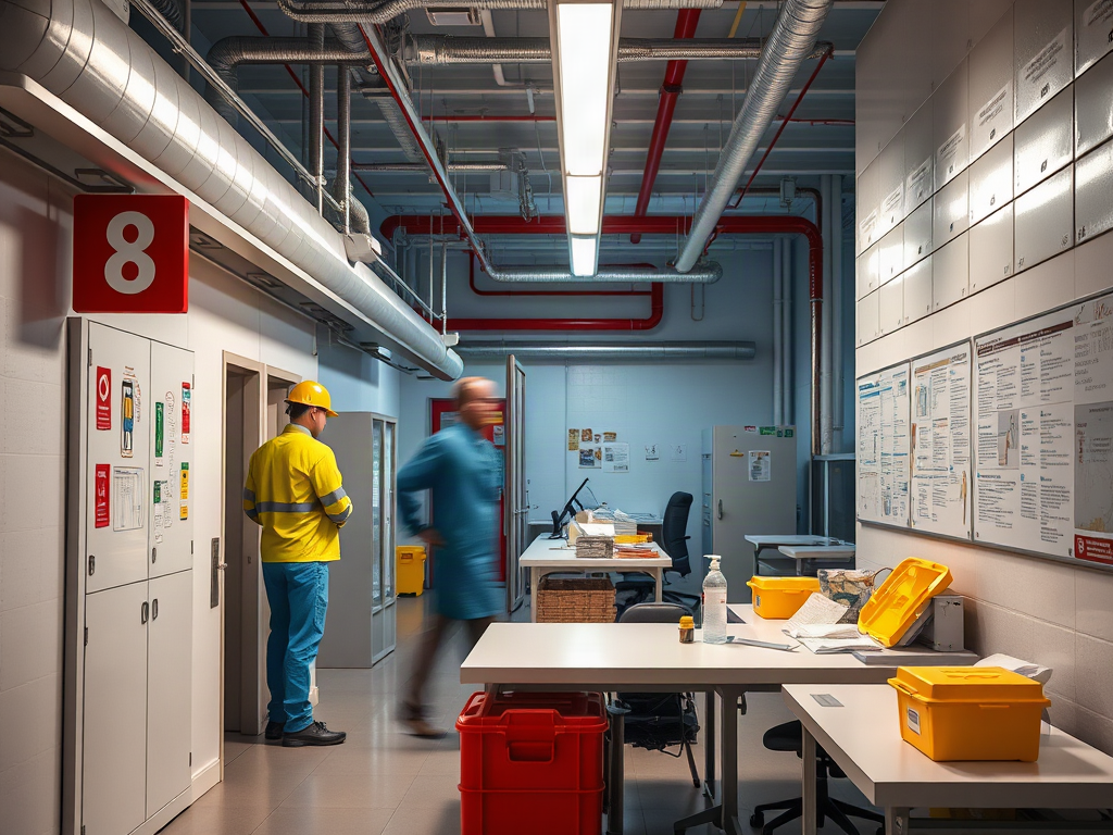
Emergency action plan pictures for staff training scenarios should show recognizable workplace locations, the correct protective action, evacuation routes, assembly areas, alarm cues, and assigned staff roles. Use photographs of the actual facility when visual recognition matters, then add restrained arrows, labels, or numbered actions that remain readable at normal viewing size. Separate evacuation, shelter, lockdown, medical response, and accountability scenes so employees do not confuse incompatible instructions. Each picture should be checked against the written plan and tested during a discussion or drill.
What Should Action Plan Pictures Show?
A useful training picture connects a visible workplace cue to a specific employee decision. Instead of showing a generic exit sign, show the sign as employees encounter it from a workstation, corridor, break room, receiving area, or other occupied space. The image should answer a practical question: What has happened, what action applies here, and where does the person go next?
The required content depends on the scenario. An evacuation sequence may show the alarm cue, nearest usable route, an alternate path, the exterior discharge point, and the designated assembly area. A shelter sequence may show the notification, the correct interior location, doors or ventilation controls identified in the site plan, and the method used to account for people. A medical-response sequence might identify how staff summon help, where essential response equipment is located, and which employees perform assigned duties within their training.
Pictures should distinguish ordinary landmarks from decision-critical details. A wide photograph may establish location, but a closer view may be needed to show a stairwell designation, door label, manual alarm device, emergency communication point, or assembly marker. Adding one clear arrow or a short caption is usually more effective than covering the photograph with competing icons. Color can reinforce meaning, but the action should not depend on color alone because viewing conditions, printing, and color-vision differences can change what employees perceive.
Consider a staff member leaving a windowless stockroom. A floor plan may show the route accurately, yet the employee may not immediately know which direction the diagram represents. A paired image works better: the first photograph shows the view from the stockroom doorway, and the second identifies the turn toward the protected route. The floor plan can then provide the larger spatial relationship. That combination preserves accuracy without assuming strong map-reading skills.
A common mistake is illustrating only the ideal path. Doors may be blocked by smoke, construction, severe weather, or the incident itself. Training material should identify the authorized alternate route where the written plan provides one, while avoiding improvised shortcuts through restricted or hazardous areas. Images must not suggest that employees investigate a threat, operate unfamiliar equipment, or take on response duties they have not been assigned and trained to perform.
Before approving a visual, check whether it shows the cue, location, action, destination, and stopping point. The stopping point matters: an evacuation picture that ends at an exterior door leaves out assembly and accountability, while a shelter image that ends at entering a room omits what occupants do after arrival. The picture set is working when employees can describe the next action without the trainer supplying missing context.
When Should You Use Photographs, Diagrams, or Symbols?
Choose the visual format according to the decision employees must make. Photographs are strongest for recognizing a real door, corridor, control, hazard boundary, or outdoor meeting place. Diagrams are stronger for understanding route relationships that cannot be captured in one camera view. Symbols communicate familiar actions quickly, but only when their meaning has been established and their placement is unambiguous.
Facility photographs reduce the mental translation required during training. Staff can compare the image directly with what they see at work, which is especially useful for infrequently visited areas, alternate exits, and assembly points. Their limitation is rapid obsolescence. A changed partition, relocated shelving unit, new tenant sign, seasonal display, or construction barrier can make an otherwise accurate photograph misleading. Tight close-ups can create another problem by removing the landmarks needed to identify where the object is located.
Maps and simplified diagrams show the whole route, adjacent spaces, and alternatives more efficiently. They are appropriate for orientation and route comparison, but a crowded plan can overwhelm someone unfamiliar with architectural drawings. Remove layers that do not support the training decision, preserve labels needed to identify rooms or levels, and include an orientation marker such as a clearly placed “You are here” point when the diagram represents a posted location. Do not decorate a map so heavily that route lines hide doors, stairs, or boundaries.
| Visual Format | Best Use | Main Limitation | Practical Check |
|---|---|---|---|
| Workplace photograph | Recognizing a location or device | Becomes outdated after physical changes | Can staff identify where the camera stood? |
| Route diagram | Showing spatial relationships and alternatives | Requires orientation and map interpretation | Are start, direction, destination, and level clear? |
| Symbol or pictogram | Reinforcing a familiar action | May be interpreted differently without context | Can employees explain the symbol without guessing? |
| Sequenced panels | Teaching actions in order | May imply every incident unfolds identically | Are decision points and exceptions identified? |
A blended format often provides the strongest training value. For example, pair a simplified level diagram with numbered photographs of the stair enclosure, exterior exit, and assembly marker. Employees first understand the route as a whole, then learn what its critical points look like. For a distributed workforce, photographs can also clarify which assembly area belongs to each building or shift.
Generic stock photography is a weak substitute when the objective is site recognition. It may still help illustrate a broad behavior, such as keeping an exit path unobstructed, but it should be labeled as an example rather than presented as the employee’s actual environment. Likewise, artistic realism is less important than accuracy. A plain, current photograph with one precise annotation is preferable to an attractive illustration that shows the wrong door hardware, alarm device, or room arrangement.
How to Build a Scenario-Based Picture Sequence
Build each sequence around one incident type and the decisions assigned to staff in the organization’s written procedure. Mixing evacuation, shelter, lockdown, and medical-response actions on the same slide invites employees to combine instructions that may not belong together. A clear sequence establishes the initiating cue, shows the immediate protective action, traces movement or sheltering, and ends with communication and accountability.
Start by walking the procedure from the perspective of different occupants. A receptionist may need to direct visitors, a supervisor may check a roster at the assembly area, and an employee in a remote workroom may need a different route than someone near the main entrance. Photograph the view each person actually has. Include night-shift lighting, secured doors, noisy work areas, or outdoor approaches if those conditions materially change recognition. Do not stage an unsafe act merely to create a dramatic image.
A compact production checklist keeps the image set tied to operations:
- Select one scenario: define the alarm, warning, or observed condition that starts the sequence.
- Identify the audience: separate general employee actions from duties assigned to wardens, supervisors, or designated responders.
- Capture decision points: photograph locations where staff must turn, choose a route, enter a protective space, or report status.
- Add minimal annotation: use concise labels, consistent arrows, and numbering that matches the spoken training.
- Verify the ending: include assembly, shelter accountability, handoff, or the point at which employees await further instructions.
Imagine a small office with two exterior exits and an assembly area behind a neighboring building. A weak slide shows a red arrow across a floor plan. A better sequence begins with the alarm cue, shows the primary route from the staff area, identifies the alternate exit without implying that employees should cross the hazard, and ends with the assembly sign and the person receiving status reports. A separate visitor panel shows where the front-desk employee directs guests. The pictures teach roles and transitions, not merely geography.
The narration must leave room for conditions that override the pictured route. An arrow can look like an unconditional command even when smoke, structural damage, security concerns, or official instructions make that route inappropriate. Captions should align with the written plan and acknowledge authorized alternatives without encouraging improvisation. Where actions differ by event, use separate panels with unmistakable scenario labels rather than expecting color alone to carry the distinction.
End production with a field check. Stand where the trainee would stand and compare every image with the current view. Confirm that arrows point in the direction a viewer would naturally interpret, captions remain legible on the smallest training screen or printed handout, and role labels match actual assignments. Signs that the sequence is failing include trainees debating which building is pictured, selecting the wrong route because of camera angle, or remembering the graphic but not the required reporting step.
How Do You Test and Maintain Training Visuals?
Test pictures by asking employees to make decisions from them, not by asking whether the slides look clear. Recognition and action are different outcomes. A person may recognize an exit photograph yet misunderstand which incident calls for evacuation, where to assemble, or who confirms their status. Short scenario prompts expose those gaps before a real event.
Show a panel without coaching and ask three concrete questions: Where is this location, what cue led to this action, and what happens immediately afterward? Use employees from different shifts, work areas, language backgrounds, and levels of site familiarity. Record the specific point of confusion. If several people misidentify the same doorway, changing the crop or adding a landmark may solve the problem. If they understand the picture but choose the wrong action, the issue may lie in the procedure, caption, or training explanation rather than image quality.
Discussion testing should be followed by an appropriate exercise or drill consistent with site conditions and organizational requirements. Compare what employees do with what the picture sequence taught. Watch for hesitation at intersections, movement toward familiar entrances instead of designated exits, uncertainty at the assembly point, and missed accountability steps. A visually polished deck is failing if behavior repeatedly diverges at the same location.
Maintenance should be triggered by change rather than left only to a calendar reminder. Review affected visuals after remodeling, department moves, access-control changes, route closures, assembly-area changes, alarm modifications, or revisions to assigned roles. Temporary construction deserves particular attention because a route can become inaccurate while the permanent training package still appears current. Date or version the picture set so trainers can identify superseded files, but do not place revision text where it obscures the action.
Accessibility also requires operational testing. Captions should carry information conveyed by arrows or color, text must remain readable when projected, and verbal instruction should describe the critical content for people who cannot rely on the image alone. Employees with mobility, sensory, cognitive, or communication needs may require individualized planning or alternate presentation formats. A visual aid supports training; it does not replace accessible instruction, hands-on orientation, or assistance arrangements established for the workplace.
A common failure mode is treating one successful training session as permanent validation. Staff composition, room use, signage, and familiarity change. Keep a correction log noting the image, observed misunderstanding, revision, and retest result. Effective visuals produce consistent location recognition, correct scenario selection, and completion of the final accountability action. Persistent guessing, conflicting interpretations, or dependence on trainer hints indicates that the material needs revision rather than more repetition.
Conclusion
Strong visual training material is built from the workplace outward. Photograph the views employees will actually encounter, use diagrams for relationships that a camera cannot show, and reserve symbols for meanings the audience already understands. Keep incident types separate, distinguish general staff actions from assigned roles, and carry every sequence through its final reporting or accountability step.
The next practical move is to select one high-priority scenario and walk it from several employee positions. Compare the resulting pictures with the written procedure, remove ambiguous annotations, and test the sequence without coaching. Confusion is useful evidence: it identifies a camera angle, label, route explanation, or procedural handoff that needs correction. Maintain the finished set whenever the site or plan changes, and use exercises to confirm that visual recognition translates into the intended workplace action.
Frequently Asked Questions
Should training pictures use the actual workplace?
Use current facility photographs when employees must recognize specific routes, doors, equipment, or assembly areas. Generic images are better limited to broad behaviors and should not be presented as site-specific instructions.
How much text should appear on each picture?
Use only enough text to identify the cue, action, or location. If a caption becomes a paragraph, divide the content into additional panels or move supporting explanation into the trainer’s notes.
Can pictures replace an emergency drill?
No. Pictures can prepare employees to recognize locations and decisions, but an appropriate drill or exercise reveals movement, communication, access, and accountability problems that slides cannot reproduce.
How often should emergency training pictures be updated?
Review them whenever routes, room layouts, access controls, alarms, assembly areas, procedures, or assigned roles change. Periodic review is useful, but change-triggered review prevents known inaccuracies from remaining in circulation.
What makes an evacuation picture misleading?
Common causes include reversed camera perspective, unclear starting points, outdated landmarks, arrows crossing walls, missing alternate routes, and sequences that stop at the exit instead of showing assembly and accountability.